Getting Around in GIMP - The Interface
![]() I’ve found myself using GIMP more and more lately to manipulate photos, and thought that perhaps some of the things I’ve been playing with might be helpful for other users as well. Especially translations of effects that are achieved by photoshop users, but replicated for the GIMP environment. It is my hope to be able to provide some level of tutorials that might help others get as much use out of GIMP as I have.
I’ve found myself using GIMP more and more lately to manipulate photos, and thought that perhaps some of the things I’ve been playing with might be helpful for other users as well. Especially translations of effects that are achieved by photoshop users, but replicated for the GIMP environment. It is my hope to be able to provide some level of tutorials that might help others get as much use out of GIMP as I have.
The main list of all my GIMP tutorials can be found here.
To help others get the most from these tutorials and GIMP in general, I am starting out my first GIMP tutorial post by quickly examining the main interface in GIMP, and what all those floating windows mean…
GIMP users often seem to feel that the user interface is a barrier to entry for them. I agree that at first it can seem odd compared to the paradigm used by other programs, but I feel it’s just a small sticking point. Spend a little time with it, and you will quickly get used to it.
In general, there will usually be 3 main (floating) windows that all of your work will be done in with GIMP:
Toolbox Window

This window houses all of the tools available to you to manipulate your image. It may seem overwhelming at first glance, but you’ll probably find that for the most part you only use a few different tools as you’re getting started (a full list of each tool with shortcut keys and description can be found in the GIMP wikibook).
The window can be considered in two halves (upper and lower). Above the foreground/background colors are all the actual tools. Below that are modifiers for the currently selected tool (the Heal brush, in this case).
Some very common tools you will likely use often are:
![]()
![]()
![]() Rectangle, Ellipse, Free Select
Rectangle, Ellipse, Free Select
![]()
![]()
![]() Bucket Fill, Gradient, Paintbrush
Bucket Fill, Gradient, Paintbrush
![]()
![]() Clone, Heal
Clone, Heal
Just below the tool palette in the center of the window is the Color Area. This displays the current foreground (black in this example) and background (white) colors. You can swap between the foreground and background colors by clicking on the double arrow just above and to the right of the colors. Choosing a new color is easily done by just clicking on the current foreground or background color.
Below the Color Area are the available modifiers for the currently selected tool. What is shown here will change depending on the options available for the tool you select to use. In this image the Heal tool is active, and the options (Mode, Opacity, Brush, etc…) will apply to the Heal tool specifically.
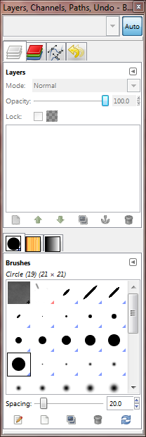
Layers, Channels, Paths Window

This window displays all of the current layers in the image (including Channels and Paths). Realistically for the most part I personally use the Layers portion of this window more than any of the others.
Similar to the toolbox, this window can be divided into an upper and lower half.
The upper half is has tabs running across the top that give you access to (from left to right): Layers, Channels, Paths, and Undo history.
I will write up more detail on using Layers in image manipulation later (it deserves it’s own post).
The lower half of this window shows access to three more tabs: Brushes, Patterns, and Gradients.
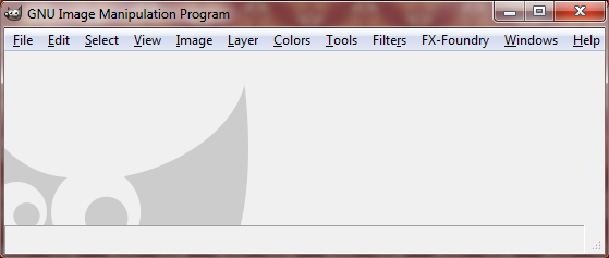
Image Window

This is where the magic happens. This window will display whatever image you happen to be editing. You’ll also notice all of the menu items that are along the top edge of this window. These menus give you full access to all of the options that are available in GIMP (you can also access all of these menu items by right-clicking in the image area anywhere).
This should serve as a (brief) introduction to the basic GIMP user interface. Hopefully this will help some people feel just a tad more comfortable about getting around and where to find things.
I have further tutorials coming up on achieving some basic effects on photographs (and hopefully some more advanced ones as well). Stay tuned for more to come!
