
Getting Around in GIMP - Color Correction
The list of all my GIMP tutorials can be found here.
I’ve noticed that many people are interested these days in color processing effects for photos, and thought I’d share some interesting things to get people started on the path to color grading.
I almost always do some sort of color toning on my photos. Sometimes a little, sometimes quite a bit depending on my mood and vision at the time. I’m a big fan of just trying things out a bit to see where it gets me, and often this will change the course I may have been heading down into a completely new direction (I encourage this idea of playing around, especially in GIMP).
(This tutorial is a deeper look at a thread I originally started on the Flickr Gimp Users Group)
To begin, we should probably look briefly at balancing the colors in a photo to make sure we have a good base to start off with…
Basic Color Correction
Sometimes an image can come out of your camera looking either a little hazy or dull (possibly lacking contrast). So how can we get some “pop” back into the image? I will usually start by adjusting the overall range of the image to suit me.
What I mean by this, is that I want to identify the part of the image that will be pure black, pure white, and middle grey. So how can we do this? Well, a couple of ways…
Colors → Auto → White Balance
This method will let GIMP automatically calculate for you it’s best estimate of what the white balance should be in the image. Sometimes this can produce OK results (and sometimes it can really mess up). I don’t personally use this option, but if you want a no-frills first guess automated for you, it’s a nice option to have.
I have also noticed that auto white balance can sometimes blow out highlights in an image as well…
Manual Balance
This is the method I have been using personally for a while now. The theory is basically that I want to identify where in the image I want the blackest blacks to be, the whitest whites, and a good middle grey point. So how can I find these quickly and easily in my photo?
Here’s a hint: Colors → Threshold
Threshold will give you a means to see where the extreme pixel values for your image occur. With it we can identify where the brightest and darkest pixels are. The basic idea is to use a Threshold to isolate the brightest and darkest pixels in your image to set the white and black points, and to use a neat trick with a 50% gray difference layer to find the middle gray point.
So let’s begin…

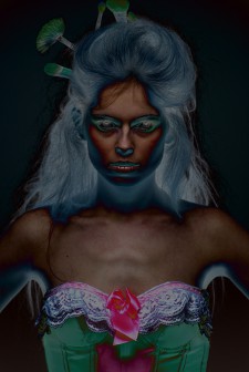
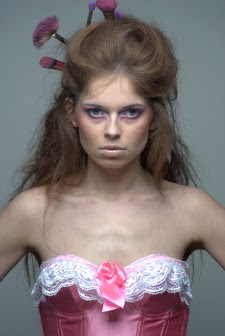
Image courtesy of Kelly Ealy - MM# 7866
Open an image you think could stand a little color correction.
Right click on the background layer and Duplicate Layer. This is the layer we will be working on fixing the color, and I’ll call this the color correct layer.
With the color correct layer active (remember: white border around it), activate the Threshold dialog.
Colors → Threshold
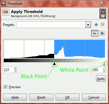
Setting the White Point
We’ll start by finding our white point in the image. The white point marker is already (be default) all the way to the right, and the black point marker is in the middle. What we’ll do is pull the black point marker all the way to the right as well.
This should make the entire image show black (with possibly some white showing in places). What this means is that the white pixels, if showing, represent the brightest pixels in your image. If you don’t see any white pixels yet, you can begin pulling the black point slider to the left slowly, and they will eventually begin to appear. You’ll want to note the location of the first white pixels that begin to show up, and either remember them or use a sample point to save their location.
An important thing to remember here is that this is often a subjective determination of what you want to be pure white in your image. Some bright pixels (any RGB component is 255) will show up in threshold, even though they may not be “pure” white. Watch out for those, as a non-neutral color chosen to be your white point will cast a color on the entire image.
Cancel out of the Threshold dialog.
Now we want to use Colors → Levels to set the white point for our image to the pixels we identified with Threshold.
Open the levels dialog (Colors → Levels), and use the Pick White Point eyedropper to pick the location of the whitest pixels we just identified.
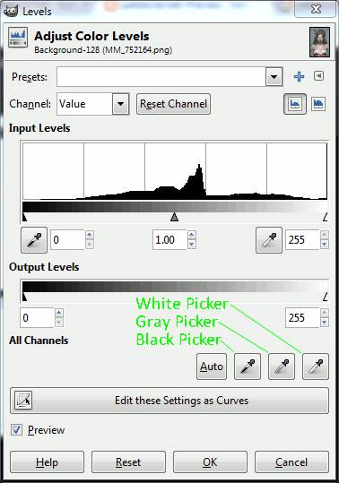
Hit OK to apply to the image. We basically just identified the location in our image we want to be pure white (255, 255, 255) in our final image.
Setting the Black Point
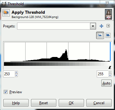
Now we can do the same procedure, but for the darkest/blackest point. Open the threshold dialog again (Colors → Threshold), and this time slide the black point slider all the way left, and do the same for the white point marker. The image should turn all black.
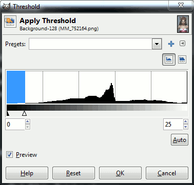
Slowly begin sliding the white point marker to the right until some white pixels begin to show up. These white pixels now represent the darkest pixel values in your image. As before, note their location (or use a sample point) and cancel out of the Threshold dialog.
Open the levels dialog again (Colors → Levels), and this time use the Pick Black Point eyedropper to pick the location of the darkest pixels we just identified.
Hit OK to apply to the image. We just identified where we want the blackest pixels in our image to be (0, 0, 0).
Setting the Gray Point
This one is a little tougher. You may not have an easily found truly neutral gray point (RGB 128, 128, 128) in your image. So we are going to use some layer blending modes to help us find the gray points closest.
Create a new layer above your color correct layer, and fill the layer with a neutral gray (RGB - 128, 128, 128).
Set the layer mode for this gray layer to Difference.
Right click on the layer in your Layers window, and choose New From Visible to create a new layer with what you can see. Make sure this new visible layer is the active one.
Now, run a threshold against this new layer.
Colors → Threshold
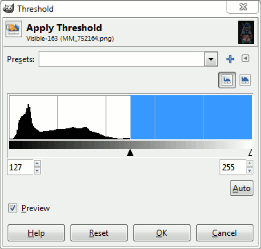
You will now follow the same procedure as you used for finding the black point threshold values, but in this case the white pixels will be those closest to Middle Gray.
Zoom into those first white pixels and remember where they are (or use a sample point).
De-activate the difference layer, and make your color correct layer active and visible. It helps if it is also the top-most visible layer (ie: turn off visibility on all layers above it in the Layers list).
Now use Colors → Levels again.
This time, use the Gray picker and choose the pixels you identified as closest to middle gray.
If you’ve chosen good points then the final result should be an image with much better looking color overall. If there was a nasty color cast previously, this method should remove it for the most part…
Here is my starting image, and after modification using this manual method:

It’s subtle, but the original image was not in serious need of any balancing.
Mouseover the image below to see a comparison on an image where I didn’t white balance properly before firing the shot (only modifications to the image were the manual color correction procedure):

Please feel free to post any comments/suggestions/rants in the comments if you get a chance to try this method out!