
If You Can't Fix It, Fake It
An interesting side effect of posting the Getting Around in GIMP tutorials has been meeting new people who are looking for help with images in some way.
I think my most heartwarming interaction was a mother who wanted some images fixed of her newborn son that had discoloration in the skin. She wanted the skin tones to be matched so that the discoloration wouldn’t be so prominent/noticeable. I was happy to take a few minutes to try and help out (the fix was relatively straightforward), and it was extra meaningful to find out that her little son did not live long after the photos were taken. (That last part in particular was especially poignant to me, being a dad myself).
A recent interesting problem was posted to me where someone had created artwork to be turned into a custom wood puzzle as a gift.
The problem that needed to be fixed was that a photograph created by the puzzle maker was taken with a small P&S camera with (likely) auto white balance under fluorescent lighting.
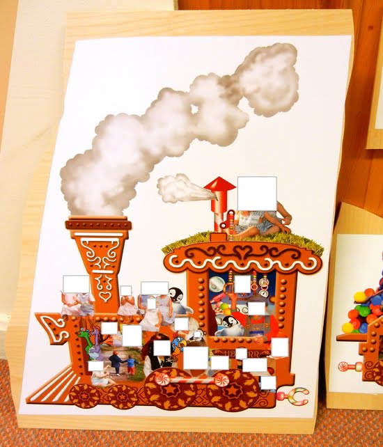
White balance is absolutely wonky here in this original photograph.
The images came out with a really nasty orange tint to them. So the question posed to me was if my recent post on color curves could help fix them to match the original artwork. In this case, no. Color correction with this heavy of a cast was not going to really be possible. The best effort from the person who sent them to me was to desaturate heavily to try and get the colors of the train closer to the original.
Other attempts at color corrections were too violent for the jpeg to handle, and nasty posterization and banding were very evident. So curves/adjustments were out of the question.
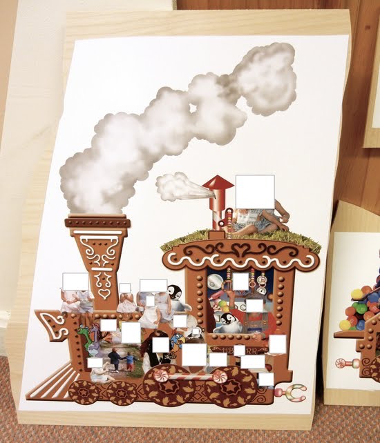
After attempting a desaturate to bring colors more in line with the original artwork.
The desaturation helped with some of the colors, but as a global operation it severely dampened the vibrancy of many of the other colors.
Below is the original artwork prepared by the person who contacted me. This original artwork represents the true colors that they wanted to match in the photograph above.
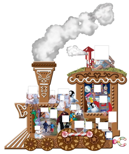
The original artwork that was printed and mounted onto the wood.
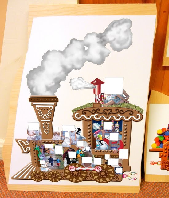
The thing that finally clicked for me in this case was when I was looking at the high quality original artwork as a reference for colors. I was trying to think of a good way to match the colors when I caught myself saying “If only I could just map this original artwork into the photograph”.
That’s when a different part of my brain said: “Well, you can map this original to the photograph: use Hugin!".
I loaded up both the original artwork and the photograph into Hugin. I set the photograph to be anchored for position, and created control points between the artwork and photo.
Once I had all my control points, I optimized the artwork (making sure that none of the checkboxes for the photograph were checked - so only the artwork would be distorted to fit).
I did a set of standard optimizations before deciding that the most important ones are for x-shift and y-shift (allowing skewing of the image).
I was pretty happy with the results, and am amazed yet again at the neat things you can do with some incredible free software:
I was glad to be able to help someone out, even if the path to getting there was a little unconventional (all that mattered was the results in this case). In the process, I learned a couple of neat new tricks to keep in my bag for the future!