Getting Around in GIMP - Black and White Conversion (Part 2)
In the first part of this tutorial we had a look at using the Desaturate command to convert images to grayscale, and how the different options in that command work to produce their results.
The rest of the tutorials in this series are here:
- B&W Conversion - Part 1 (Desaturate)
- B&W Conversion - Part 3 (Decompose)
- B&W Conversion - Part 4 (Pseudogrey/c2g/Layers)
- B&W Conversion - Part 5 (Putting it All Together)
We saw how the Desaturate command can use straight numerical evaluations for conversion (Lightness and Average) as well as using the relative luminosity model for how our eyes will perceive brightness based on color.
These are fantastic and easy to use conversion options that require no extra work on your part to get to a grayscale image. Almost every other option from here on out will require you to make choices and adjustments to get your results.
This time around we are going to have a look at another very widely used method for converting to grayscale, the Channel Mixer.
Channel Mixer
Using Desaturate let you convert to grayscale based on pre-defined functions for calculating the final value, but what if you wanted even further control? What if you wanted to decide just how much the red channel should influence the final gray value, or to have more control over the ratios and weightings of each of the different channels independently? That is precisely what the Channel Mixer will allow you to do.
For the examples below, I’m going to mix it up with a different color gradient test map, blue to blue HSV gradient, with a gradient to black vertically. This represents our entire colorspace (feel free to download this image to follow along).

So let’s have a look. The Channel Mixer can be invoked from:
Colors → Components → Channel Mixer…
When it opens you’ll be presented with the main window:
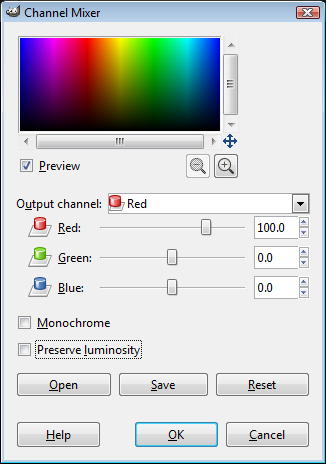
Now, you can use the Channel Mixer in your full color mode if you’d like, but I’m not going to go into that here. We want to get a grayscale conversion, so you can check the option for Monochrome (this will grey out the Output channel option in the dialog). This will turn your preview into a grayscale image.
I’ll come back to the Preserve Luminosity option shortly.
Warning: Math Ahead
If all you did was check the Monochrome option, and if you left the Red channel slider at 100, then you’ll be seeing a representation of your image with no Green or Blue contribution (ie: you’ll basically be seeing the Red channel for your image):
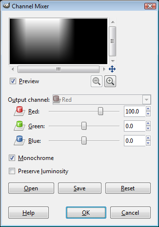
Basically just the Red Channel
What this means is that with Green and Blue set to 0, it will look at the value of the Red in your pixel, and map it directly to a grayscale value. If your pixel RGB values were: 200, 150, 100, then the Value for the pixel would become 200, 200, 200.
The sliders represent a percent contribution to the final value .
For instance, if you set the Red and Green channels to 50(%), you should see something like this:
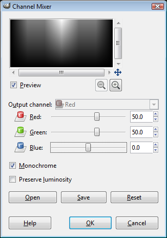
Red at 50%, Green at 50%, Blue at 0%
In this case, Red and Green will contribute 50% of their values (and nothing from Blue) to the final pixel gray value. Considering the same pixel from above: 200, 150, 100, we would get:
So the final grayscale pixel value would be set to: 175, 175, 175.
Preserve Luminosity
‘These go up to 11.’ - Nigel Tufnel
The astute will notice that the sliders actually have a range from -200 to 200. So you may be asking - what happens if two channels contribute more than what is possible to show?
For instance, what if both the Red and Green channels were set to contribute 100%?
Well, Channel Mixer will allow us to set these values, but we can’t very well set the grayscale pixel value to be 350. So anything above 255 will simply end up being clipped to 255 (effectively throwing away any tones above 255 - bad!).
This means that you have to be careful to make sure that each of the three channels contributions don’t exceed 100 between all of them. 50% Red, 50% Green is ok - but 50% Red, 50% Green, AND 50% Blue (150%) will clip your data!
This is where the Preserve Luminosity option comes into play. This option will scale your final values so the effective result will always add up to 100%. So, the scale factor from above would be calculated as:
So in our case above, the 350 would be scaled in half (0.5), giving the actual final value as 175. If Preserve Luminosity is checked, all the values will be scaled by this amount. (No clipping = good).
This is not to say that you need to always use Preserve Luminosity, just stay aware of the possible effects if you don’t.
Speaking of Luminosity
You’ll notice that Channel Mixer basically gives you control over each channels weightings, and in the previous post I showed the function used for desaturating according to relative luminance. If you wanted to replicate the same results that Desaturate → Luminosity produce, you can just set the RGB sliders to the same values from that function (21.3, 71.5, 7.2).
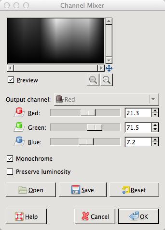
Replicating the luminosity function.
If you’re just getting started with Channel Mixer, this makes a pretty nice starting point for you to begin fiddling.
Begin Fiddling
It’s tough to find representative images to demonstrate using Channel Mixer, but I managed to find a very pretty landscape by Cyndi Calhoun on Flickr called Garden of the Gods - Looking North (cc-by):
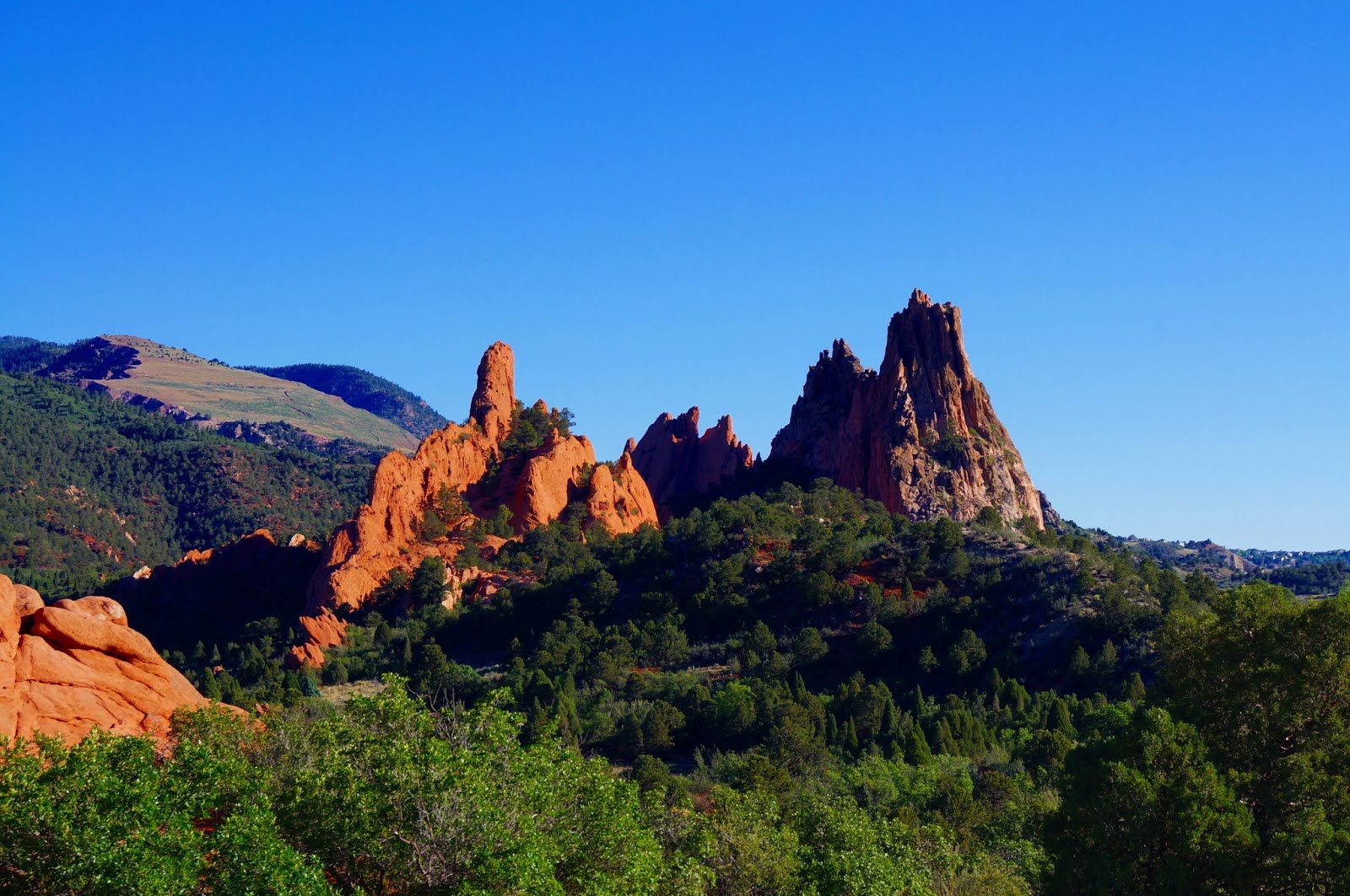
If possible, you’ll want to keep in mind the primary RGB influences in different portions of your image as a means for approaching your adjustments. For instance, this image (not coincidentally) happens to have strong Red features (the rocks), Blue features (the sky), and Green features (the trees).
I am going to want to try to keep any of the individual channels from getting so bright you lose detail (blowouts), or from crushing shadows too much. Remember, you want to try and keep as much tonal detail as possible!
So I’ll use the luminosity function as a starting point…
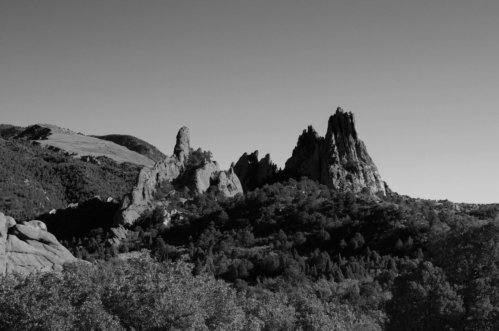
Straight conversion using the luminosity function.
It’s not a bad start at all, but I feel like the prominence of the red rocks in the sunlight has been dulled quite a bit. It’s a central feature of the image, and should really draw the eye towards it. So we need more pronounced reds to make the stone pop a little bit more.
I’ll turn on Preserve Luminosity, and begin bumping the Red channel to taste.
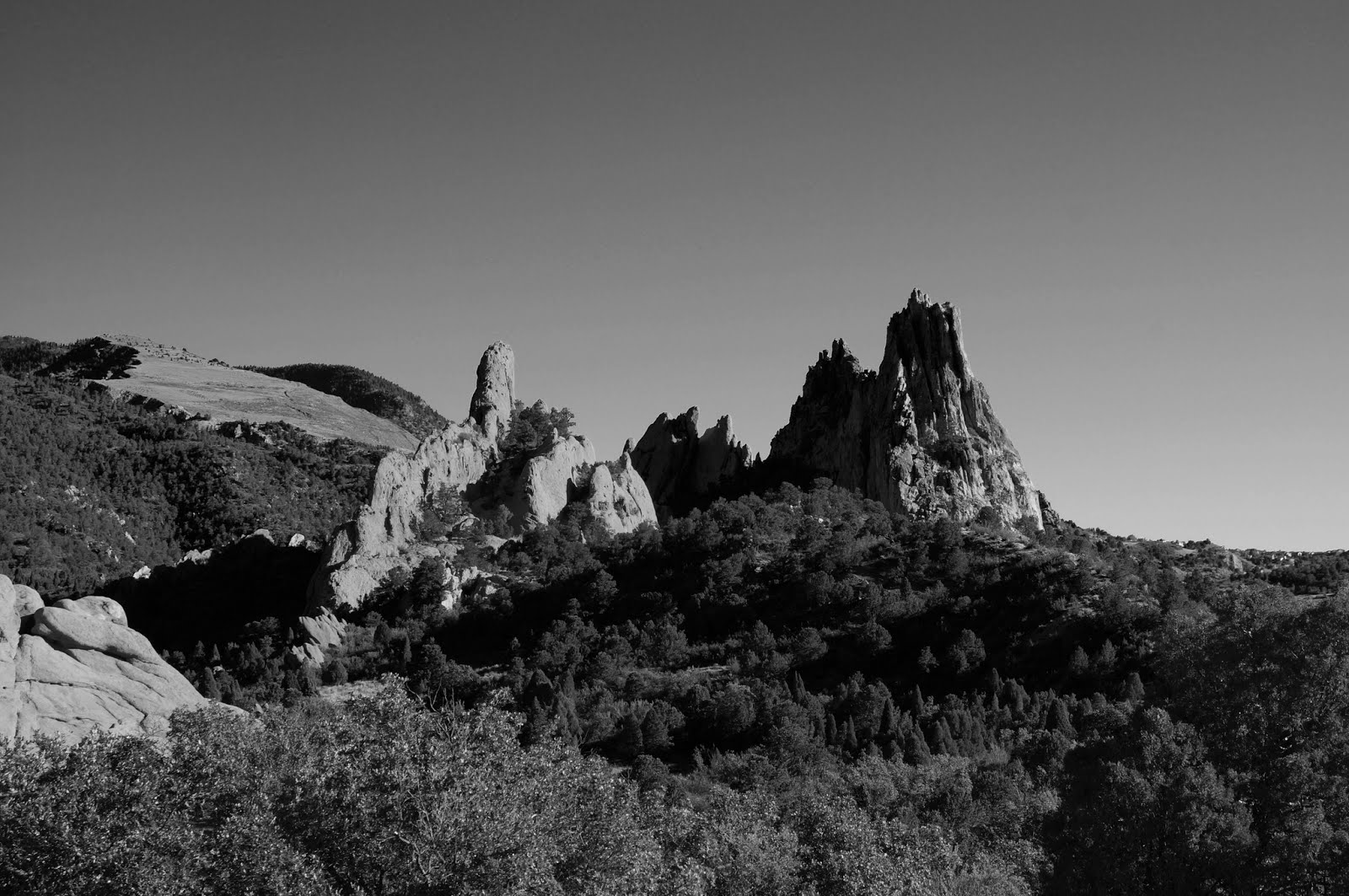
Red channel bumped up to 66.1
This gives a little more prominence to the red stone, I think.
The Green channel feels like it might be ok to me, but for comparison, try lowering it to about half of the Red channel value. (Remember - Preserve Luminosity is checked - so the final values will scale to give Red values twice the weight as Green now).
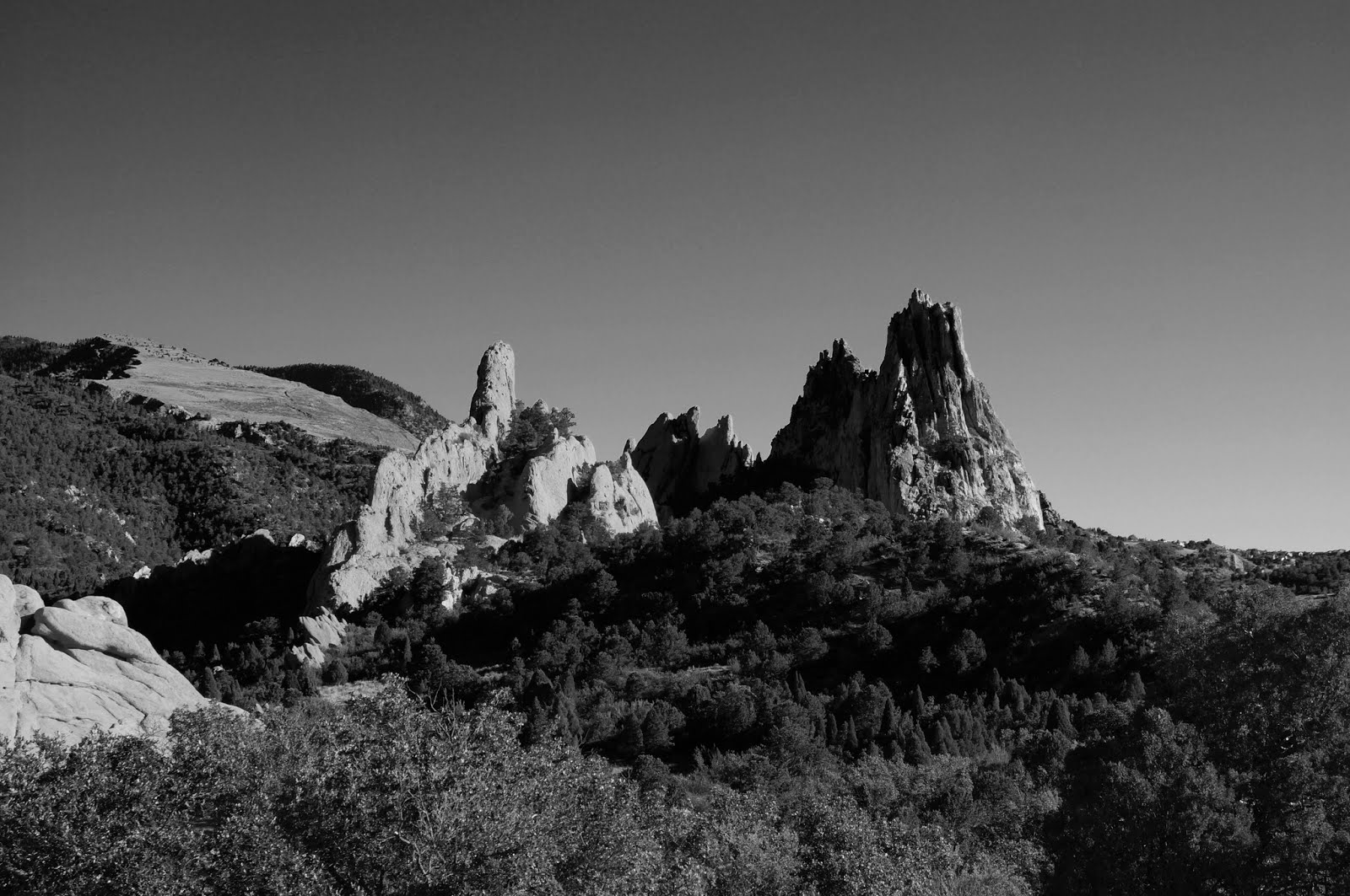
Green channel value at ~half of Red.
If you’re wondering why the red rocks got brighter, consider the math. Previously, Red and Green were very near each other in value (around 70), so both colors had approximately equal weight (There was more red than green in the rocks, obviously). When Green got its influence cut in half, red scaled to take a much larger influence, and because there was more red than green, the final value will end up higher.
So, if we look at the RGB values of the rock, we’ll find that it’s roughly like this (we’re ignoring Blue at the moment because for this example it’s staying constant):
If both Red and Green have equal weighting, the final pixel value will be:
Now if Green is only half as strong as Red, the value will be:
I had to divide the result by the influence amount to scale the way Preserve Luminosity would. You can see that the final pixel value will become brighter in this case. This is why the red rocks get brighter when you decrease the Green channel.
It should go without saying, but the Blue channel will have a lot of influence on the sky (and many areas of the image in shadow). So if we wanted the sky to look a little more dramatic, we could remove the Blue channel influence by setting it to 0:
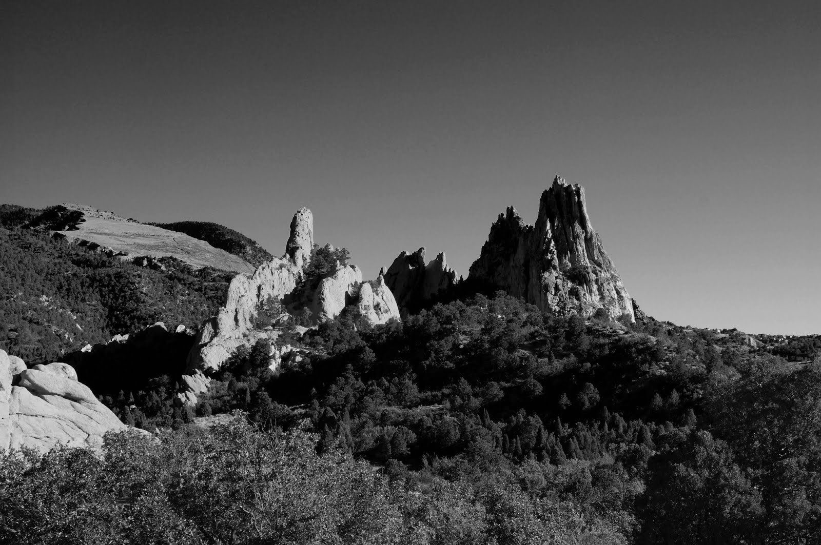
Same as before, but Blue channel set to 0
This will darken the sky up a bit (as well as some shadow areas).
You’ll need to pay attention to what these changes do to your image in closer views sometimes, though. In our case, there is a higher amount of banding and noise in the smooth sky if values get pushed to extremes. So try to approach this with a light hand if possible.
The sliders also allow negative values. This will seriously crush the channel results when applied (and will quickly lead to funky results if you’re not careful). For example, to push the Blue channel even darker in the final result, I’ve set the Blue channel to -20 here:
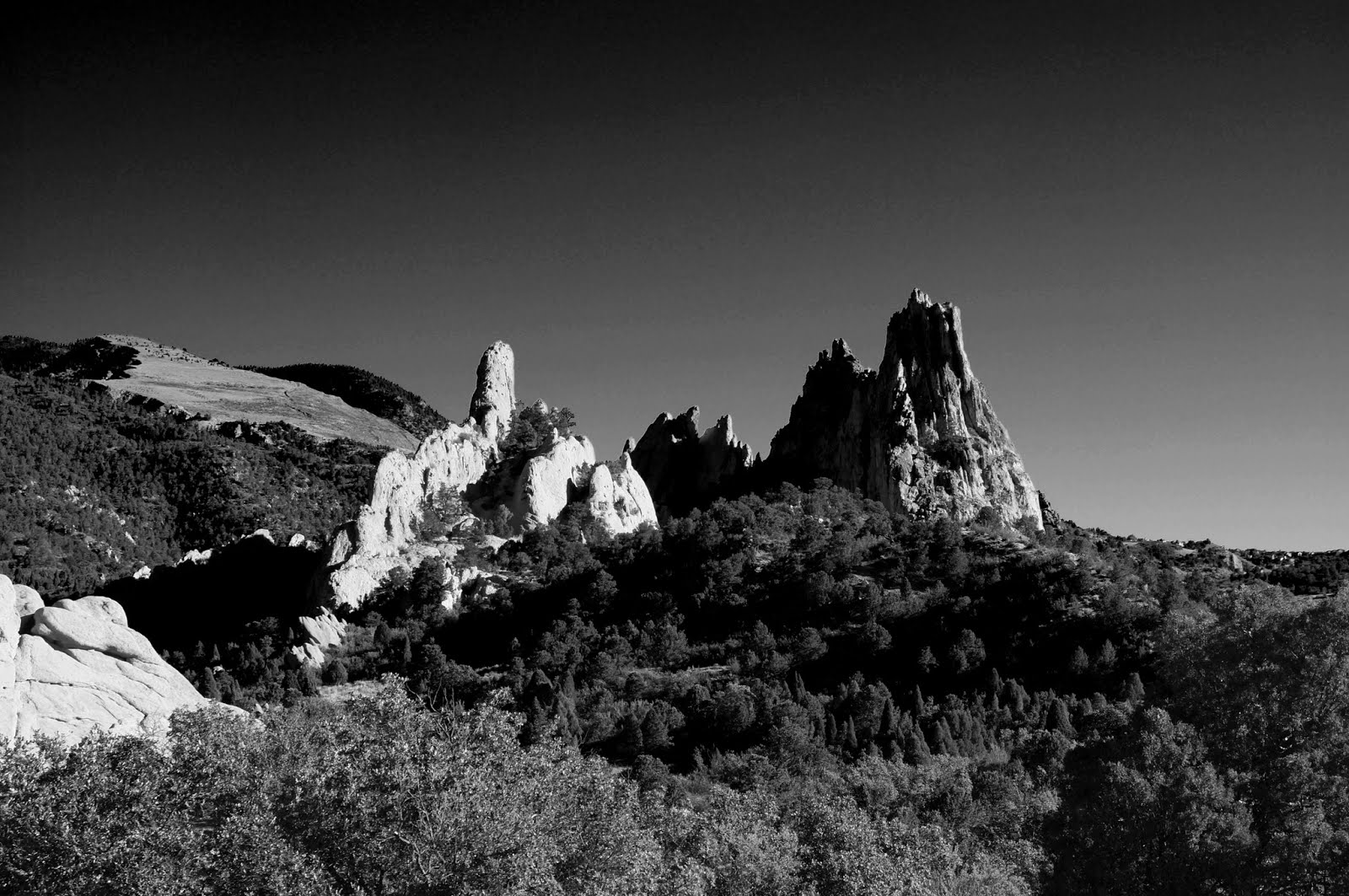
Red: 66.1, Green: 33, Blue: -20
The sky has become much darker, as have the shadow sides of the rocks. There is an overall increase in contrast here as well, but at the expense of nasty noise and banding artifacts - especially in the sky.
Rules of Thumb
Generally, the Red channel is well suited for contrast (especially in the brighter tones). The Green channel will hold most of the details, and the Blue channel contains grain and (usually) a lot of noise.
In skin, the Red channel is very flattering to the final result, and you’ll often get great results by emphasizing the Red channel in portraits.
On Skin
The Red channel can be very flattering on skin, and is a great tool to keep in mind when producing portraits. For instance, below is the color image of Whitney from the first part of this tutorial:

The straight luminosity conversion is below. Mouseover the image to compare it to one where the Red channel is set equal to the Green channel (giving greater emphasis on Reds):

B&W Film Simulation
Due to the popularity of the Channel Mixer as a straightforward means of conversion with nice control over each of the RGB channel contributions, many people have used it as a basis for building profiles of what they felt was a close emulation to classic black and white films.
I’ve borrowed the table from Petteri Sulonen’s site that shows some commonly used RGB Channel Mixer values to emulate B&W films. These aren’t exact, of course, but some of you may find them useful, so I wanted to include them here.
| Agfa 200X | 18,41,41 |
|---|---|
| Agfapan 25 | 25,39,36 |
| Agfapan 100 | 21,40,39 |
| Agfapan 400 | 20,41,39 |
| Ilford Delta 100 | 21,42,37 |
| Ilford Delta 400 | 22,42,36 |
| Ilford Delta 400 Pro & 3200 | 31,36,33 |
| Ilford FP4 | 28,41,31 |
| Ilford HP5 | 23,37,40 |
| Ilford Pan F | 33,36,31 |
| Ilford SFX | 36,31,33 |
| Ilford XP2 Super | 21,42,37 |
| Kodak Tmax 100 | 24,37,39 |
| Kodak Tmax 400 | 27,36,37 |
| Kodak Tri-X | 25,35,40 |
Bonus!
I’ve written and added a Script-Fu to registry.gimp.org that will automatically create new layers for each type of film emulation in the table above, with the proper channel mixer settings. You can also choose to create a “contact sheet” of the converted layers for comparison instead.
In Summary
There’s a good reason that the Channel Mixer is such a popular means for converting an image to grayscale. It’s flexible, and allows a great level of control over the contributions from each channel that makes up your final image.
Unfortunately, the only way to preview what you are doing is in the tiny dialog window. Even with zooming it can sometimes be frustrating to make fine adjustments to the channel contributions.
I encourage you to give it a try on some of your own photos to see the effects that are produced by emphasizing some channels over others. This will become important later as we look at using entire decomposed channels of data, and ways to blend and mix them to produce our final result.
Stay Tuned
In a few days I’ll be back again to have a look at a slightly more intensive way of approaching your grayscale conversions: Decomposition (RGB, LAB, etc).
Part 3 will show how we can decompose an image and use the different channel layers to build up to a grayscale image! It’s a slightly more intensive process, but the level of control is fantastic and beyond anything we’ve talked about so far.


