
A Quick Look at Quality (Google+ vs. Flickr)
I had recently taken some photos of my friend Mairi, and wanted to share them. Lately I’ve been using Google+ more and more (they just make it too easy to use), and photographers seem to be one of the larger groups of users.
So I decided to see what my images would look like on Google+ as compared to Flickr (my mainstay), or even 500px. I’ve been a Flickr user for years (I think the $25USD/year for a Pro account is a pretty good deal for what it offers), and it’s been my reference for a while.
So, let’s take a look!
Reference
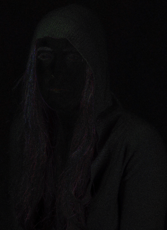
I’m using a recent photo of my friend Mairi as a reference. Specifically, the final 100% jpg output at full size when I was done playing with it in GIMP.

My reference image.
This is the same image I initially uploaded to Google+ and Flickr in full resolution, at 100% JPG quality, optimized, progressive, DCT Floating Point, Subsampling 4:4:4.
I resized the image in GIMP before uploading here to 550px wide, and used Sinc (Lanczos3) resizing (don’t worry, I’m just putting this up here for reference), and exported as PNG using RIOT.
Method
So what I did was, after uploading the full quality image in it’s final form to both Google+ and Flickr, I then went and re-downloaded the image from the same services. Google+ will resize your images to a maximum side dimension of 2048px for you (unless you upload directly through picasaweb/Picasa).
So I used the 2048px size as the output from both Flickr and Google+ (they both provide a resized version of your image at those dimensions). I brought them into GIMP, and compared them by setting one layer over the other in Difference blending mode.
To emphasize what I was seeing, I ran a simple Colors → Auto → Normalize against the difference results.
Here’s the resulting Difference:
Of course, anytime you run an image through a compression algorithm, there are bound to be differences in the results. It’s important to keep in mind, too, that the Flickr file at 2048 pixels clocks in at about 1.4 MB in size, while the Google+ version is half that at 745 KB.
Here is a 200% crop of an area of interest from Flickr (mouseover for comparison to Google+):
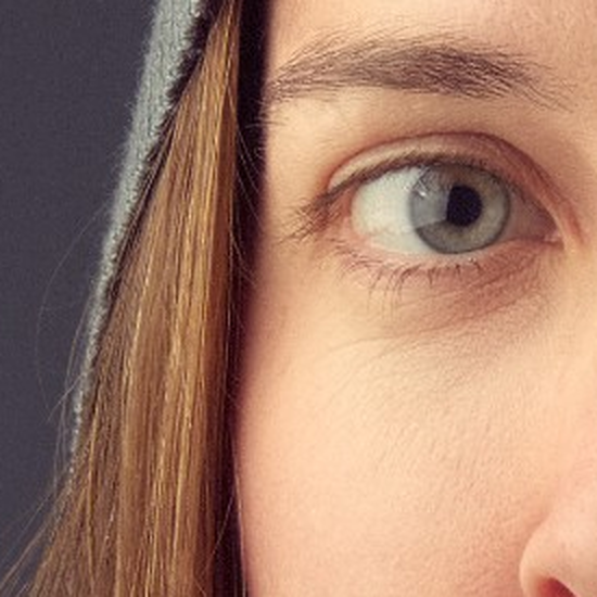
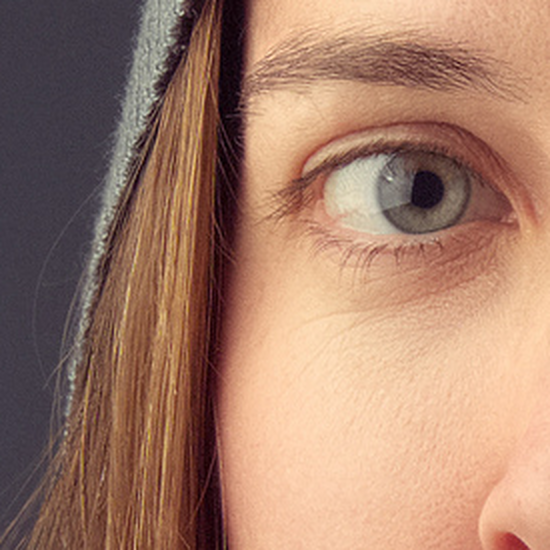
Here’s another 200% crop of the background grain from Flickr (mouseover to compare Google+):


Results
To my eye, the extra compression that Google+ is adding to the images is not good. There’s some aliasing effects along sharp edges that I don’t like, and areas of smooth color + grain fare very poorly. There’s also some softening/smearing that occurs at the Google+ compression stage that I don’t like.
Take this with a grain of salt, of course. These images are being viewed again at 200%, and pixel-peeping. For instance, here are both images resized to 550 pixels wide (Flickr first, mouseover to compare to Google+):


And here is a simple 100% crop of a similar area of interest from earlier (again, Flickr first, mouseover for Google+ comparison):


I think given the choice I would opt for the Flickr version every time. It’s a bigger file, but even at 2048 pixels, it’s still not likely to exceed 2 MB for an image. A small price to pay to keep the viewing quality of the image a bit higher…