A Simple Headshot (of Myself)
I needed a new headshot for something recently, and I figured it might be fun to expand a little on something I started playing with while shooting my friend Mairi. I wanted to work on getting my backgrounds blown out to pure white.
I think this was mostly due to reading the great Zack Arias “White Seamless Tutorial”, and trolling around on The Strobist again. I also just got my camera back, so it was as good a time as any to put it through some paces… (Plus, I needed the practice).
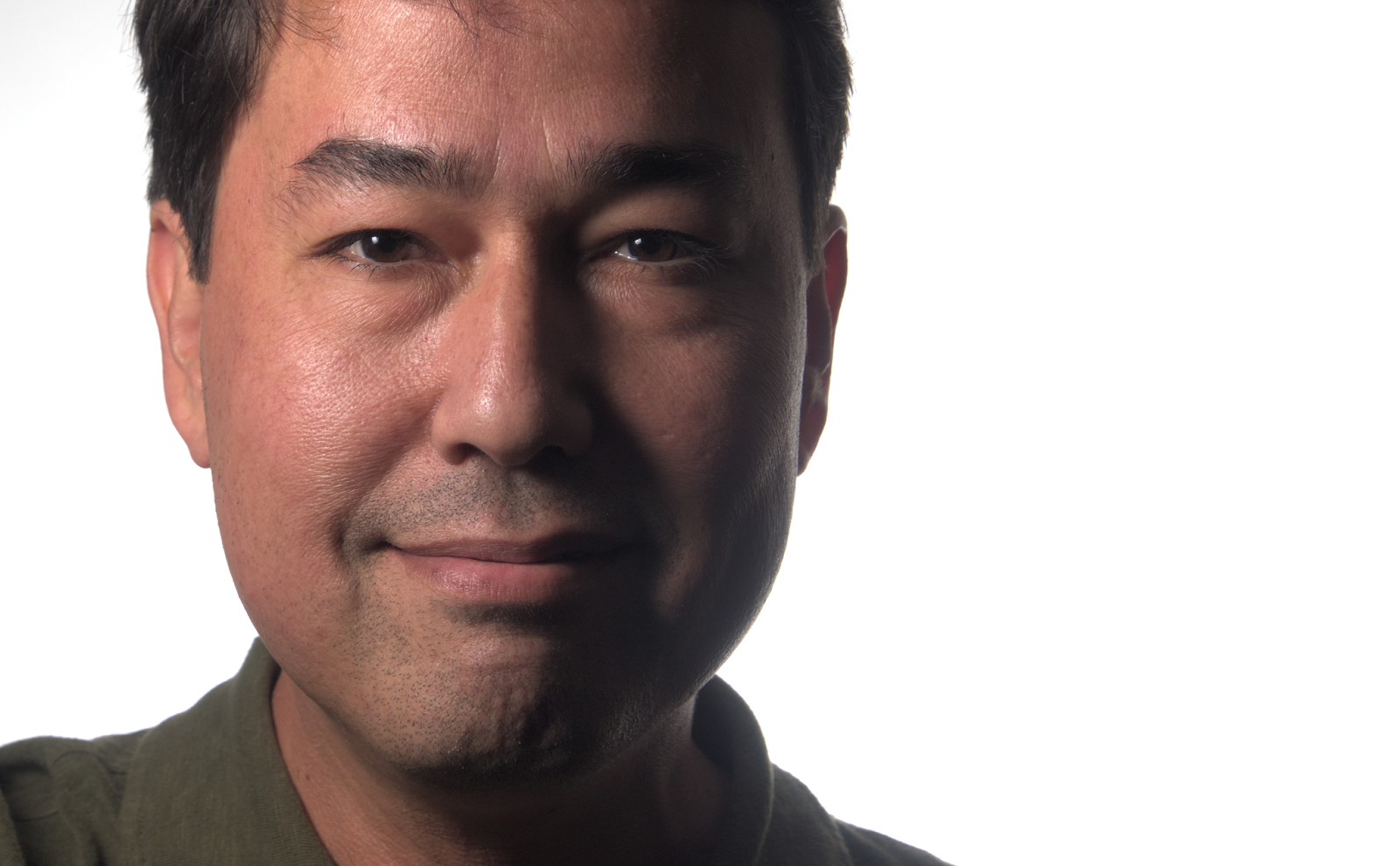
So first, here is the final result after all of my fiddling:

Could have been a lot worse, I think…
So my first desire in shooting this was to play with getting the background blown to pure white. I happened to have a whiteboard in my office conference room that I figured would be a good background to start with.
I setup one Yongnuo YN-560 II on a stand just a couple of feet from the whiteboard, firing back into it. I had to adjust the distance a little in order to get the right spread. A couple of test shots later, and I was able to dial in the exposure to just blow out the background to white. This was going to give me a base to work from.
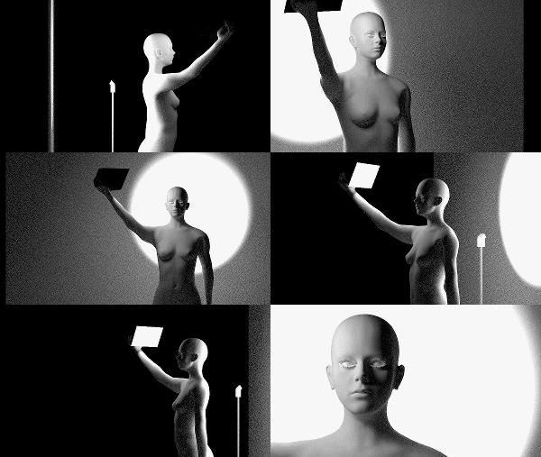
Because I apparently lack the drive to buy proper equipment, I didn’t have a light stand handy to hold my key light. I also didn’t have my larger softbox handy to use for this. I did have a smaller 6” × 8” Softbox, so I went with that instead. So this meant that I had to hold the little softbox in one hand, and point it back to me. Here’s a quick render I did to show what my setup looked like (and no, I don’t have breasts like that — mine are fuller):

If you need a video instead of an animated gif, here it is (and how does YouTube not know how to handle a 960×540 resolution properly?):
So what I had was, one YN560 at just over ½ power firing into the whiteboard behind me, and a second YN560 in the small softbox, handheld, at just under ½ power. After cropping, this is the image straight out of the camera (well, the RAW after RawTherapee with some leveling):

See? Told you it could’ve been worse…
I notice right away that I’m over-driving my background. I wanted to get a little wrap on the dark side of the face, but instead have the background leeching onto me a bit too much (the slight flare shows this too well). At least the background is white, though, right? :)
You’d think if I was going to bother reading a tutorial, that I’d at least pay attention to what it said, right? It’s funny because Zack specifically shows a case of the BG being overexposed. The flare and loss of contrast on the subject is an effect of this.
The softbox was just a bit too small for my taste. One this small is really only useful up super-close to the subject, I think. Otherwise it’s a bit too hard for me.
Still, I don’t think the image is a loss (but I’ll definitely spend a few extra minutes dialing in the ratio between subject and background next time). I purposefully kept the shadows a little brighter from my RAW conversion, and would push them down a bit in GIMP.
Into GIMP I just moved along with my normal workflow. Wavelet Decompose where I stayed mostly on residual with a touch of the largest scale. Mostly just to smooth out my skin tones a little. Some slight dodging and burning to bring some volume back, levels to push the blacks down and to increase the contrast a little more. Finally, Petteri Sulonen’s Portra-esque color curve to finish it off.
Here’s the final result again (mouseover to compare to the original):

Two other things that I think are worth mentioning. I couldn’t help but try Peter Hurley’s advice to bring the head forward to help accentuate the jawline (and hopefully remove unsightly turkey-neck), but even more interesting was the slight squinting of the eyes. Not like I forgot my glasses, but more of squinting with the lower lids of my eyes.
I have really bad bags under my eyes that are a permanent fixture of my face, and slightly squinting with my lower lids really helped alleviate some of that apparent bagginess. I didn’t retouch those bags at all, which was nice.
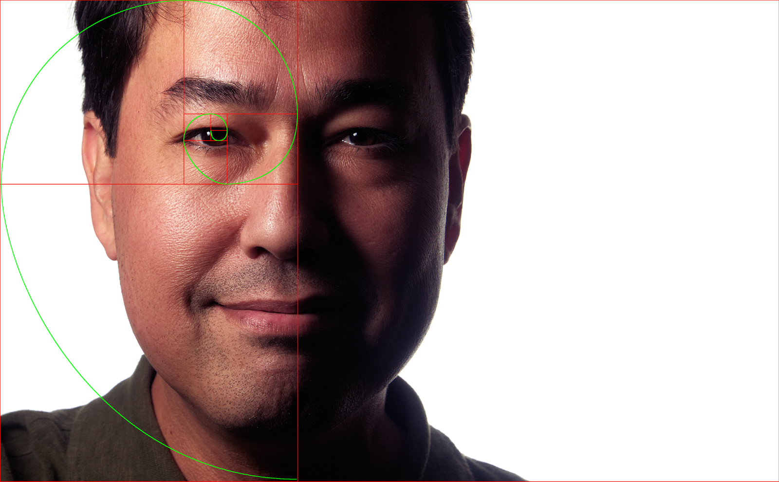
The other thing is the crop, in case anyone was wondering:

Fn = Fn-1 + Fn-2, seed F0=0, F1=1
Thirds are for chumps.
Not really, but figured if I was going to play with the crop, might as well have some fun with a Fibonacci sequence, right? Why not!
