An Open Source Headshot (Ronni) (Postprocessing)
In my previous post I had to do a bit of fiddling to bring my relative exposures back into line with each other (while retaining hair details from being blown out). Now that the image has been corrected, I’m ready to begin my normal workflow for retouching.
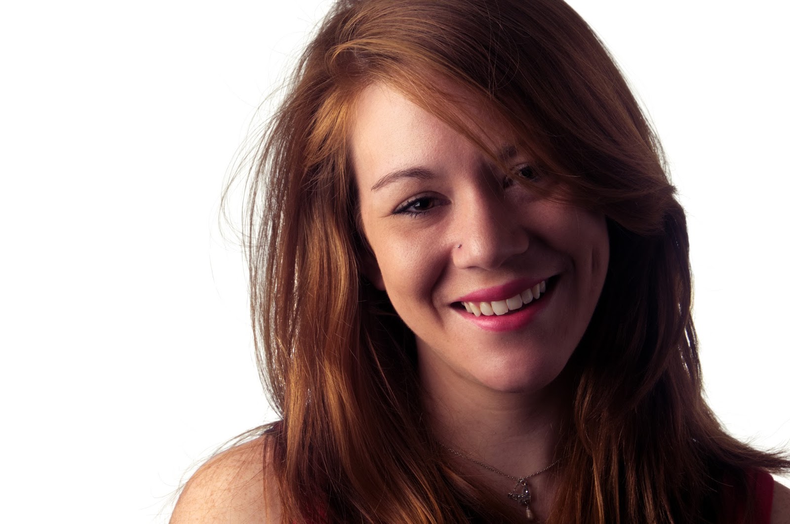
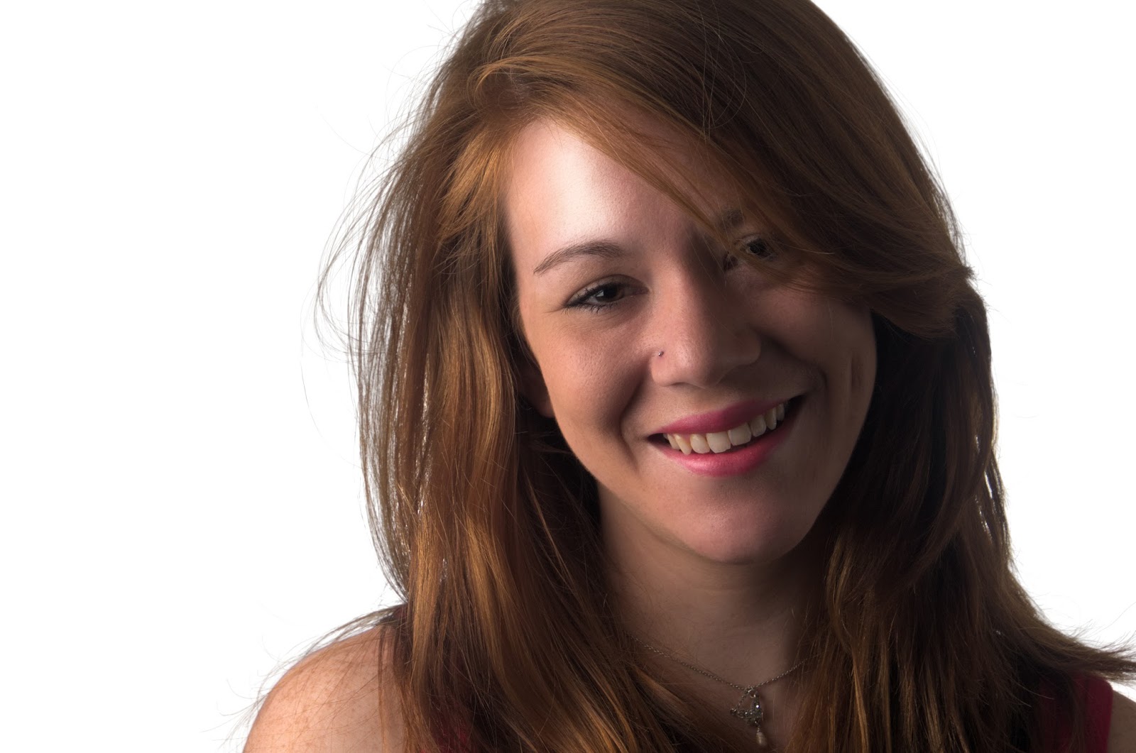
To give us an idea of what we’re working towards, here’s my final result for this image:
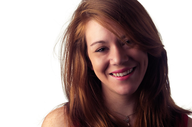
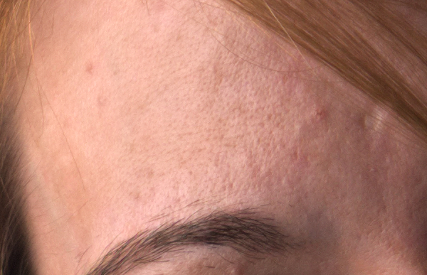
After my corrections in the previous post, here’s the image I’ll be starting with:

There’s a few different ways to approach retouching this image, and it’s really dependent on the personal preferences of the retoucher. Some may like to fiddle with colors and tones first to set a mood, or possibly look more at general cropping/layouts to taste for instance. There’s quite a few ways to begin, so I can only speak to what I personally like to do.
File downloads:
My General Workflow
- Wavelet Decompose
- Spot Corrections/Healing
- Dodging & Burning
- Color Toning
This is just a general set of steps that I tend towards when considering an image. I’ll sometimes mix these up a bit, but each of these gets some sort of consideration from me when retouching.
Wavelet Decompose
I’ve written about using Wavelet Decompose (WD) for skin retouching before, and as part of my previous Open Source Portrait walkthrough.
I will usually start here because it’s where I’ll have the most control over various aspects of the image that are important (skin in the case of a headshot like this). I like to have skin and details under control before I move on to any other retouching.
This time around, I’d like to focus a bit on visualizing the contributions from the different scales, and how they combine to produce your final result. Hopefully with the result of gaining a better feeling for what the different frequency scales can do for you.
I’ll start by decomposing the image to 5 scales (+residual).
Remember, the low-numbered scales represent the fine details in your image, and increase the detail size as you move up to the residual scale. The residual scale maintains the (majority of) color and global contrast information.
I’d recommend starting at a higher scale or residual when beginning to retouch, but this is just my personal preference (I often rarely touch the lowest couple of scales for instance).
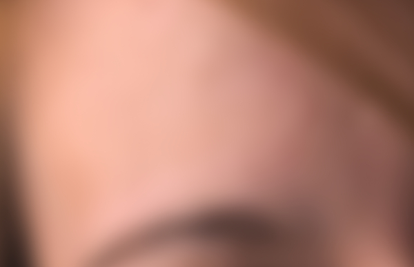
Residual Scale
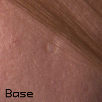
So, let’s start by taking a careful look at the residual scale isolated from the rest of the scales. Here is a 100% crop of a section of my image, looking only at the residual scale:
If you toggle between the Residual scale and the base image, you’ll see how the Residual scale contains the color and contrast information. If you want a clearer view, move back away from your monitor and look at this from a distance. You’ll see what I mean.
More importantly, you can see how the Residual scale contains the underlying color tonal data for the skin. There is a slight reddening in the brow, and a slightly darker coloration around the temple of the subject.
This scale contains the large contrast changes as well, and will add to the perception of depth through the shadows/highlights. If there is skin discoloration, or areas that need slight smoothing of the underlying tones, this is a great place to start.
Here I am highlighting areas that I may want to address, and that might lead to a perception of uneven tones:
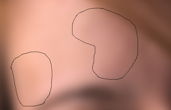
So looking at this we can see that we might like to smooth these tones out a bit. There are a few different ways we could proceed. We could use the Heal or Clone tool, we could use the smudge tool to push tones around, or my personal favorite: Gaussian blurring the area.
The reason I tend to use Gaussian Blur is that I don’t necessarily want to obliterate the tones, but rather I’d like to make them a bit smoother overall. Painting in the areas can sometimes lead to strange/hard color shifts in the tones that are not appealing, whereas blurring will smooth the tones out (relatively) evenly.
So I’ll use the Free Select Tool, and set it to “Feather edges” around 20px.
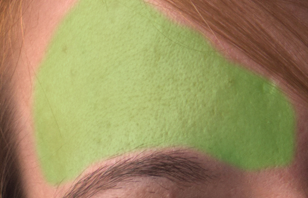
I’ll make a selection based on the contours of the face that I want to target. I mention this in my previous tutorial, but here is an example of the general regions I will work on:
This is just a rough guide, and I’ll usually take into account the angles and lighting when choosing regions on a per-image basis.
For this example I’m going to work on the forehead region as shown above. I’ll Free Select around the hairline/hairs, and above the eyebrow.
Just a couple of notes on my process:
I will usually do my region selections with all of the wavelet scales visible (giving me a composite view of the entire image). This allows me to avoid selecting too close to fine detail edges, which will produce an unsightly smearing with some scales.
It should go without saying, but I’ll usually have the scale I am working on selected in my layers palette (you’ll see a white border around the active layer). Keep this in mind as you work on different scales.
I’ll also usually hide the selection border when applying my blurs (Ctrl + t or ⌘ + t), just don’t forget to toggle it back on or you’ll tear your hair out wondering why something is not working.
The size of the Gaussian Blur radius is really a function of your taste at this point. Using too large a value will obliterate the contrasts across your region, using too little may not smooth out the tones enough for you. The best advice I can give is:
“Err on the side of too little.”
For my image, I chose to go with a radius of 45px on the Residual scale. Here are the results:

As you can see, the tones have smoothed out slightly, and are not as prominent (even without any further scale edits). There is a slight decrease in the contrasts in the region, which visually help to de-emphasize any uneven tones or skin slightly.
The thing to keep in mind at this point is that we are just trying to get a good base of relatively even tones under all the details. Don’t go nuts at this point, as there are still a couple of scales we will be working on as well (and the effects are additive).
Detail Scales
Each of the wavelet scales has their layer blending modes set to Grain Merge to re-constitute your full image. The problem is that it can sometimes be hard to isolate what each scale does visually to your image. So I’ll point out a neat trick to help.
Just remember one thing about what I’m about to show you:
“Don’t show this to your model.”
Especially if you want to remain friends with them. :) We are going to highly emphasis all of the wavelet scales to show us places where we may want to work.
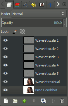
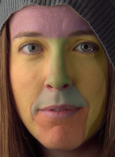
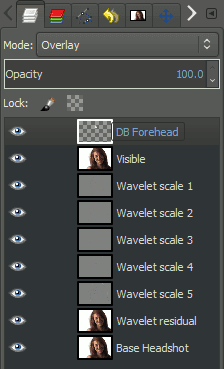
All we need to do is, with all of the layers visible, to turn off the visibility of the Wavelet residual layer. This will leave all of the scale layers visible over the base image, and will show you all of their contributions. It’s not flattering.

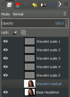
On the right is my current layers palette to show what I’m looking at.
All I’ve done is hide the Wavelet residual layer, and have allowed all of the detail scales to be overlaid on my base image.
This severely emphasizes the contributions from the detail scales, and while it’s not flattering it does offer us a clear view of areas we may want to touch up.
Toggle the residual scale on/off to get a feeling for what the scales are doing to your final result.
You can actually use a similar method when you’re exploring the contributions from a single scale. In this case I would leave the base layer visible, and toggle the scale you are interested in to quickly see its contribution.
Wavelet scale 5
The largest detail scale I’ve got is Wavelet scale 5. This is usually the next best place to modify larger tonal changes under the skin, and can often do a great job of evening out complexions on its own.
To see what scale 5 is doing to our image, I’ve left the base image visible, and toggled on only Wavelet scale 5 below:
The best way to think about this scale (usually) is to remember that it likely contains larger tonal values underneath your details. I’ll be a little aggressive when smoothing this scale sometimes, just keep an eye out for over smoothing.
Here I’ve tried a couple of different radii, but finally settled on 22px as a reasonable result (Ctrl/⌘ + z and Ctrl/⌘ + y are your friends - I use them all the time to toggle back and forth between applying the blur and not).
So after applying the 22px blur to Wavelet scale 5 on the same selected region as I previously used on the Residual scale, I’ve got this so far:

Honestly, at this point I would probably stop working in this area. The underlying tones look reasonably smooth, and any further touchups would be more about spot corrections as opposed to larger scale tonal changes.
Some images may require a small amount of extra smoothing on a lower Wavelet scale (like 4), but I personally like the results so far. Still good skin texture, with more even tones.
Spot Corrections
Once I feel like the underlying skin tones are under control, I have two options for considering any spot healing/touchups that I want to do.
One option is to tackle them while still using Wavelet scales. I already have them separated, and I’m already working on the scales so this is a natural option.
The other option is to combine all of the edits so far into a new layer, and to use either the Clone Tool or the Heal Tool to make spot corrections.
Wavelet Spot Retouching
This is mostly dependent on your experience and eye, as some corrections are better suited (and faster) to using a Heal/Clone Tool. In some places the Wavelet scales can be indispensable. For instance, looking at the forehead we’ve worked on so far, there are some immediate places where I can see it would be easier to use a heal tool:
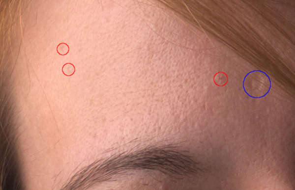
The areas in red show great candidates for simply fixing with the Heal tool. They are relatively small and without any major discoloration or tone issues. They also have good source textures very near them.
The slight blemish in blue show a better candidate for retouching using Wavelet scales. It’s a larger blemish that does have underlying tonal changes to it (the spot is noticeable across multiple scales: 3, 4, 5). It also occurs behind strands of hair that would make it harder to correct while still looking natural. This is a great example of where Wavelets are so handy - we can correct the blemish on scales that won’t destroy those hair details across it.
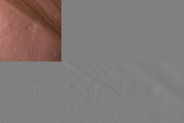
As you can see in the above scale breakdown, the blemish is very visible on scales 3, 4, and a small bit of tonal change on 5. It’s also slightly visible on scale 2. In approaching this I would probably start with the Heal Tool on scale 5, and work down from there.
As you can see above, even by scale 3 the blemish is mostly gone (and not noticeable at all in the full image for normal viewing), and the hair details haven’t been affected over it.
I’ll repeat this process for places where they would need it in my region before moving on. I will also sometimes use a combination of Wavelet spot retouching along with Healing/Cloning on the composite image. If a blemish has redness or discoloration around it, I will try to correct for the underlying tones first using scales, and worry about the details afterwards.
Spot Retouching with Heal/Clone Tool
When I’ve corrected for tones in all the places where I need to, I’ll create a new layer from all of the visible layers to do the spot Healing/Cloning on.
There is no special magic here other than normal use of the Heal/Clone Tool. I’ll sample from nearby textures that retain similar lighting and tones, and brush the tool over the blemishes to remove them.
Here are the results of spot healing the areas identified previously as being good candidates:

Finishing Up Skin Retouching
That is basically my process for this image in a nutshell. I’ll repeat the above steps for each region of interest to me until I am happy with the final result.
It may seem like there are still many places that could use touching up in the view above, but remember that we are pixel peeping here. I’d recommend zooming wayyy out often to get a feel for how the skin looks from further away. You still need to have texture in the skin to look natural.
Remember to err on the side of too little!
Finally, here are my results after applying the above to the different regions of the face:

Dodging & Burning
I personally tend to refer to D&B as more of “Contour Painting”, which is how I approach the process. The general idea is to use D&B to enhance the contours and perceived volume of the subject by manipulating highlights and shadows (the primary means by which we judge volume and shape in a 2D image).
I will usually use transparent layers over my image, and set them to Overlay blend mode to do my contour shaping. Though really you can use whatever method suits you (addition/screen/dodge/lighten for highlights and similar for shadows).
More important is that you get a good feel for the contours of your subject, and how the light is already falling across them. Usually you’ll want to use D&B to enhance those contours to taste.
For instance, smoothing on the Residual scale will sometimes decrease contrast in your image a bit. I’ll use my D&B layers to bring some depth back to those areas.
Let’s have a look at the forehead. I’d like to emphasize the lighter areas where the softbox is hitting her face first. So I’ll add a new layer over the image, and set its Blend Mode to Overlay. I’ll use white as my foreground color and paint with a large radius brush along the contour I’d like to highlight:
You can see on the right that I had a single transparent layer set to Overlay blend mode. I painted on this layer with pure white, and a round brush with 25% hardness and a fairly large size (400).
I painted along the areas of greatest highlight, then applied a gaussian blur with a large radius (111px) to smooth the result.
You’ll want to experiment with the size of both the painted areas as well as the gaussian blur to taste.
Once you’re happy with the contour highlight, you’ll want to dial the opacity of this layer back. Wayyy back.
For example, this forehead highlight is the largest in area, as well as the brightest highlight area in my entire image, and here I’ve dialed the opacity back to only 22%:

As with most things I’ve been talking about, use a light touch. Try to keep the D&B opacity levels low to keep it natural looking.
I’ll also keep using separate new layers for each highlight/shadow I add. This allows me to independently adjust the opacity of each addition to taste.
I continued with the same basic idea of painting white on new layers with a large brush, blurring those layers, and then adjusting opacity of each area. In total I’ve done the forehead, nose, cheek, and chin; these are the results when I’m done:
Hair and Eyes D&B
I will also apply a similar method for highlighting regions of hair sometimes. The principle is the same, follow contours and apply highlights to accentuate features (in this case the wonderful color of the models hair).
I’ll also add a slight accent to the iris of the eyes. I’ll follow the same principle, but add the highlights to the iris opposite the light source. Use this with a light touch as well (you’ll notice immediately when it looks overdone and unnatural). I set the hair highlights opacity to about 40%, and the eyes to about 30%.

That is about all I want to do to this particular image with D&B. Remember that you can also accentuate shadows by following the exact same procedures, but using black as your painting color instead of white. The same principles apply: follow contours in order to enhance them in some fashion.
Color Toning
At this point I will sometimes also do a little teeth whitening. I won’t go into the details of the method, as there are already quiet a few tutorials around for whitening teeth in GIMP. The general idea is to make a selection of the teeth (quick mask and a soft brush helps here), and apply Colors → Hue-Saturation. Lower the Saturation to whiten, and raise Lightness to offset the brightness. This is yet another place where you want to use a really, really light hand.
My final step before I’ll call an image finished is to do some color adjustments of some sort. Sometimes it may be a slight curves modification to increase/decrease contrast (as needed).
Usually I’ll apply a curve I have already defined and like. If you haven’t played with curves before I address them here, as well as here.
If you’ve been reading my ramblings for any amount of time (or paid any attention to my photography), you’ll know that I’ve been really, really partial to Petteri Sulonen’s emulation of Kodak Portra film. You can read more about what he did, as well as download the curves themselves from his post.
So at this point I’ll create a new layer from all of my visible layers. I’ll apply my curves on this new layer. Here is the final result using Petteri’s Portra-esque color curve: