
Getting Around in GIMP - Luminosity Masks
There was a recent thread on the GIMP users forum at Flickr on how to generate luminosity masks (and use them I suppose). I figured I would chime in a bit here with how I generate and use them in my own workflow. There is an older and interesting discussion about Luminosity Masks by Tony Kuyper that was referenced in that thread, and this is a translation of sorts for GIMP users that want to accomplish the same thing. The original tutorial by Tony is here: Tony Kuyper’s Luminosity Masks Tutorial
The basic premise of luminosity masks is to allow you to modify elements of a layer masked to a specific region of luminosity (or value). If I wanted to control the colors in the shadows of my image without modifying the mid tones or light tones, then this is the method you want. Similarly you can adjust just the mid tones, or light tones without affecting the other regions as well.
If you are new to layer masks (or need to brush up), I recommend you head to Getting Around in GIMP - Layer Masks to brush up first, then come back.
Some Theory
What we’d like to accomplish is to produce masks for our image that target a specific tonal range (lights, mids, or darks). This way, we can make adjustments to the image on a layer, and to use the masks to only apply those changes to certain areas (based on luminosity or value). The nice thing about using our image as the base for the mask is that the tonal ranges in the image will provide a smooth transition between the different layer masks.
Even though you may want to modify some aspect of the lighter portions of your image, it will be hard to tell where that effect is applied as it fades to a gray or black. Don’t worry if this sounds strange, it will become clear before long…
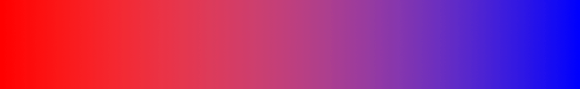
To illustrate what we want, I am going to create a simple image with a gradient that goes from full white to full black:

Lights Mask
Now, across this gradient we may want to make modifications, but restrict them to the lighter values. This is usually the simplest mask to create, and just involves making a desaturated copy of your base image (based on Luminosity). So, create a copy of your base layer, and run:
Colors → Desaturate
and check the box for Luminosity.
After doing this, my gradient image will look exactly the same. I’ll normally rename this layer to something original and creative, like Lights. That’s actually all there is to it! Let’s see it in action, though, to find out how this helps us.
I’m going to create a new layer in my image filled with red, and I am going to turn the visibility off on the other layers. So now my image looks like this:

At this point I will add a layer mask to my red layer by Right-Clicking on the red layer, and choosing Add Layer Mask…. I’ll usually just initialize the mask to White (full opacity), because I’ll be changing it shortly anyway.
Then I will want to copy my Lights layer by activating it (Left-Click on the layer), and then choosing:
Edit → Copy.
Now just paste this into the layer mask on the red layer by activating (Left-Clicking) the red layer mask, then doing:
Edit → Paste.
This will give you a Floating Selection (Pasted Layer) on your layer window, and you can just Right-Click the Floating Selection layer, and choosing Anchor Layer. This will now paste your Lights layer as a layer mask, and you should now see this:

My Layers palette now looks like this:
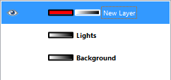
Basically, we can now change whatever we want on the red layer, and it will only affect the lighter parts of that layer.
Darks Mask
We can produce another mask that will only affect the darker parts of our image by simply inverting the Lights layer. First I’ll duplicate the Lights layer, then invert the colors on that layer:
Colors → Invert
To keep things straight in my head, I’ll find an even more original and interesting name to rename this layer, like Darks.
To show the two masks being applied to my image, I’ll create another new layer below the red layer, and fill it with a nice blue, then add a layer mask, and copy-paste the Darks layer into the layer mask the same way as above.
This results in:
My layers palette for this image:
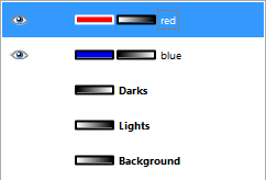
The reason that they are not perfectly blended exactly in the middle of the gradient is due to the layer ordering on my palette (red above blue). What we are seeing here is that the Lights and Darks layer masks only allow the portions of their layer to show through according to the mask (red shows through the Lights mask, and blue shows through on the Dark mask).
Mids Mask
There is one more mask we can make from these Light and Dark masks, and that is a mask for the Mid tones. This is simply the difference between the Light and Dark masks, inverted:

Lights Mask

Darks Mask

Mids Mask - Difference between Lights and Darks, inverted.
To create this mask easily, just make visible your Lights and Darks layer, then set the one on top (Darks in my example) to layer mode: Difference.
Right-Click on the top layer, and choose New from Visible. Then, invert the colors on the new layer (and name it something interesting… say… Mids).
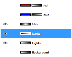
Darks layer set to Difference mode, then created a new layer from visible, and inverted the new layer colors to get the Mids Mask.
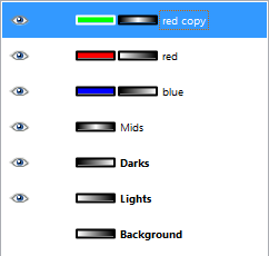
If we now take our image strip one step further and add a green filled layer, and apply the Mids mask to it, we have this:
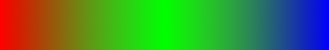
Solid Red, Green, and Blue layers with all masks applied.
The layers palette:
There is one other thing that bears mentioning here, and that is the range that each mask allows through. The Lights mask you will notice went from pure white, all the way to black, with many shades of gray in between. If you wanted one of your masks to not affect other tones as much, you can simply adjust the mask levels to remove other shades.
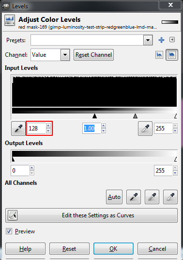
For instance, the red layer above the blue layer in the example above showed red extending past the mid tones and into the darker tones. You could clamp each mask to only affect from mid tones to either Light or Dark by adjusting each layer masks levels. You would basically activate a mask, then go to
Colors → Levels…
And set the Input Levels Black Point to 128 (middle gray). This will make the Lights mask stop affecting anything right at the middle gray point.
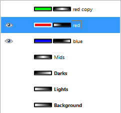
If you do the same thing to the Darks mask, then each mask will stop affecting anything right at the mid-point of values (they won’t bleed over into each other). If I do this, and hide the green layer, we’ll see:

Lights and Darks mask clamped at the mid point to prevent spill-over.
Layers palette:
The main thing to take away from this is that you can create these masks, and then narrow the range of tonal values they apply to by adjusting their range (using Levels). This can then let you filter out specific tonal ranges in your image to modify, independent of other areas.
A good example to see this in action would be to try some… Split Toning!
Split Toning
In my opinion, this is probably the easiest way to ease into how Luminosity Masks should work. The basic premise behind split toning is that you want to color a black and white image using two different colors: one color for the darks, and another color for the lights. In my example below, we’ll use this image from the Dauphin Street Beer Festival in Mobile, AL.:
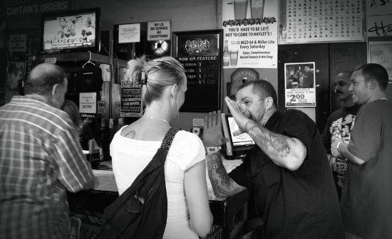
Conversation in Hayleys on Flickr (insert funny caption in the comments!)
You can download this image from my Flickr photostream if you’d like.
Now, we need to make some artistic judgements with how we want to split-tone this image. In honor of teal & orange madness, we will use a teal color to tint the dark areas of the image, and a nice orange for the lights.
With our newfound knowledge of how luminosity masks work, this should be a piece of cake, right?
Let’s create those masks…
- So load up your image, and duplicate the Background layer.
- Desaturate it using Luminosity. This is now your base Lights layer (might want to rename it for clarity).
- Duplicate this new Lights layer, and do Colors → Invert to invert it. This is your base Darks layer. Rename it to Darks
- This step is optional, but if you wanted to clamp the Lights and Darks layers to not overlap, on each layer of the two layers do a Colors → Levels, and set the black points to 128 (see above).
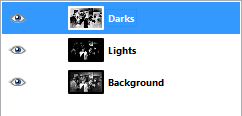
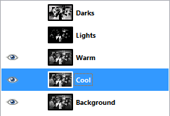
You should now be looking at a layers palette that looks like this:
Now you have your Lights and Darks masks. The next step would be to add some color to your image. How you go about this is entirely up to you, but I will walk through a simple example.
-
Turn off all layers except your Background layer.
-
Copy your Background layer twice (we’ll use one for the cool dark tones, and the other for warm light tones). Name them something descriptive (I’m going to use “Warm” and “Cool”).
-
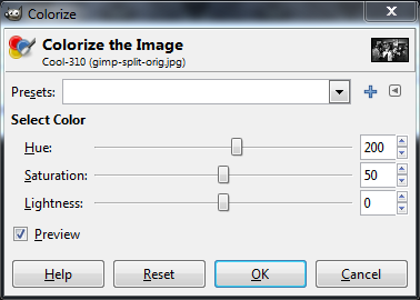
Now we need to tint each layer with the appropriate color. We’ll start with the cool layer. You can tint this layer using any method you’d like, but for the purposes of this tutorial I’ll use Colors → Colorize….
-
Your Cool layer should have a nice blue-ish tint to it right away (if you can’t see it, you may have to hide any layers above it). Let’s get it more teal-like by changing the Hue to about 200 in the Colorize the Image dialog:
-
Nice, but the entire image is now tinted teal. This is where we can apply the Darks layer mask to restrict the teal tint to the darker tones in the image only.
-
Add a layer mask to the Cool layer (Right-Click the layer, and choose Add Layer Mask… - you can initialize it to white, we’re going to replace it in a moment.)
-
Select your Darks layer, and copy it (Edit → Copy).
-
Now select the Cool layer mask, and paste in the Darks layer you just copied. Right-Click the new Floating Selection (Pasted Layer) and Anchor Layer to apply it. Your image should now change, and you’ll notice that the teal tint is only applied to the darker tones in your image. Halfway there!
-
Now on to the Warm layer! Select it, and again run Color → Colorize…
-
This time we want to use a warmer color for the light tones, so set the Hue to around 20. Your layer should have a nice orange-y tone to it.
-
Apply the Lights layer mask to the Warm layer. Right-Click the Warm layer, and choose Add Layer Mask…, again initializing to white is fine.
-
Select your Lights layer, and copy it (Edit → Copy).
-
Select the Warm layer mask, and paste in the Lights layer you just copied. Anchor the Floating Selection to apply it.
That’s it! You should now notice that all the darker tones in your image have a cooler teal color to them, while the highlights will have a warm orange color. The separation of tones is all due to the Lights and Darks layer masks that you’ve applied:

You could also go a step further here if you’d like and generate a Mid-tones mask as well for further experimentation! I know this has been long, but hopefully it’s been helpful. I will write another post addressing how to further narrow the range of tones in your masks to specifically target even smaller sections of the image.
Feel free to ask any questions in the comments.