
Getting Around in GIMP - Black and White Conversion (Part 4)
The first part of this tutorial looked at GIMP desaturate to convert to grayscale, the second part investigated using the Channel Mixer to decompose to grayscale with varying contributions from red, green, and blue, and the third part looked at decomposing an image into its constituent color channels in various modes.
This part of the tutorial will focus on a couple of semi-automated methods for converting to black and white, as well as utilizing GIMP layer blending modes.
The rest of the tutorials in this series are here:
- B&W Conversion - Part 1 (Desaturate)
- B&W Conversion - Part 2 (Channel Mixer)
- B&W Conversion - Part 3 (Decompose)
- B&W Conversion - Part 5 (Putting it All Together)
Pseudogrey
I had previously written about achieving True Pseudogrey in GIMP, including writing a quick script-fu to automate the process.
The basic approach in Pseudogrey is that you can achieve a much higher density of tones converting to B&W by allowing single pixels to stray just a tiny bit away from pure gray (basically add an imperceptible amount of red, green, or blue in order to provide a finer gradation of luminosity values). I refer you to the original post for the full technical explanation.
The results from using Pseudogrey will follow the same model as for Luminosity desaturation, but will produce a larger range of luminosity tones (1786 possible shades vs. 256).
There are a couple of ways to convert your images to pseudogrey. You can use the script-fu I wrote previously by downloading it from one of the places below:
You can download the Script-Fu for Pseudogrey here:
or you can get it here:
Alternatively, if you’ve installed G’MIC (which you really, really should do), then you’ll find it under the Black & white options. There will be an option for Pseudo-gray dithering at different levels.
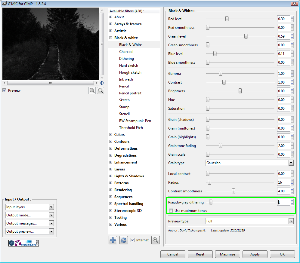
If set to 1, it should yield the same type of result as my script-fu (technically, G’MIC pseudogrey dithering should be more accurate, though). Higher levels will allow stronger color casts to be applied to each pixel to increase the luminosity range even further.


Pseudogrey is especially helpful in areas with very slight tonal value changes, as this is often where banding will become visible in an 8-bit image. In the example above, the left image shows banding that is mostly eliminated with just a single pseudogrey level on the right.
Sometimes the converted image will look good to you just as it is, but more often than not I will use a Pseudogrey conversion as a base layer under further manipulations. I’ll just adjust the opacity of the layers above it to allow a bit of the Pseudogrey layer to show through (or a lot, depending on my mood/taste).
GEGL C2G
The Generic Graphics Library (GEGL) is the underlying graphics engine for GIMP going forward. There is one neat function in GEGL specifically for B&W conversions, and that is Color2Grayscale (c2g). It can be called from the Tools menu in GIMP:
In episode 84 of Meet the GIMP, Rolf covers c2g briefly. Paul Bou also looks at using c2g for B&W conversions in a little more detail, and Joel Cornuz also asks if c2g could be the “ultimate” B&W converter.
I don’t know if c2g is worth all of the hyperbole, but it does some very neat things.
What c2g will do is consider each pixel relative to it’s neighbors within a given radius, and will adjust the value of the pixel to a gray. This gray value is evaluated as a function of perceived luminance weighted against it’s neighbors.
The actual description of what c2g does from GEGL.org is:
Color to grayscale conversion, uses envelopes formed from spatial color differences to perform color-feature preserving grayscale spatial contrast enhancement.
In practice, what c2g will do is attempt to scale the values of pixels in it’s neighborhood (radius) to contain black, white, and gray tones between. This will lead to a much more contrasty image than you started with.
What some people love about c2g is that it will also introduce a nice range of “grain” during it’s conversion. If you don’t care for this noise/grain, then it can be ameliorated by adjusting settings.
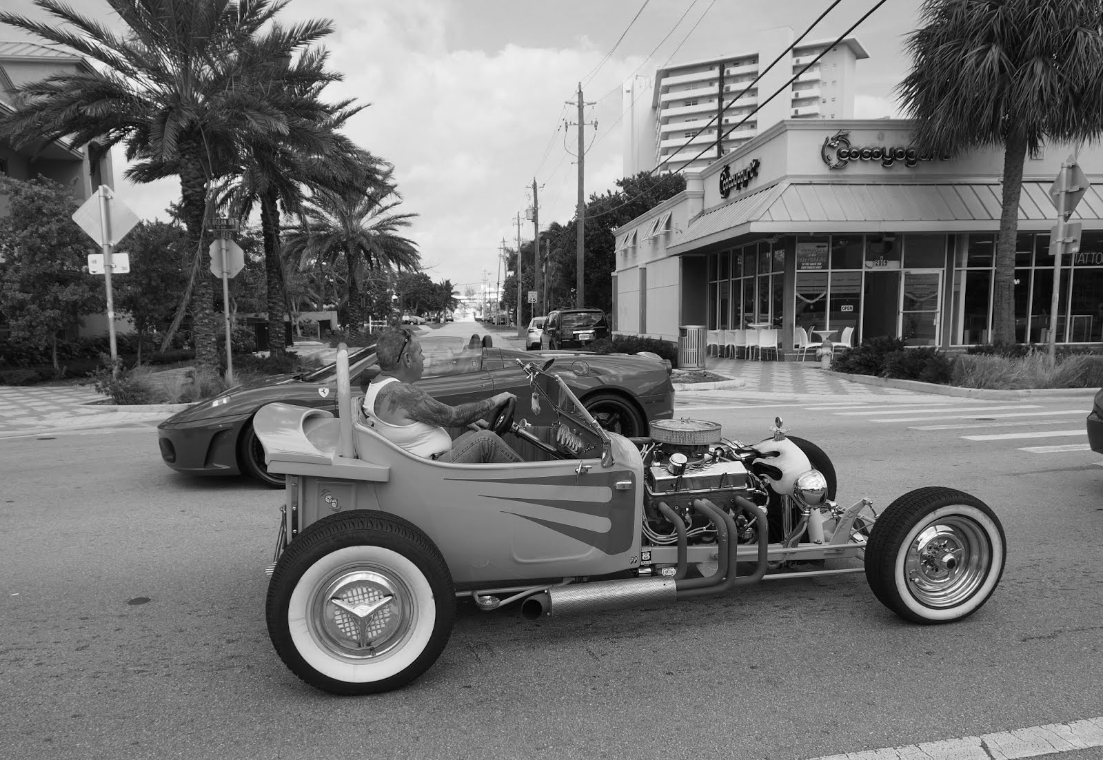
Straight desaturation in GIMP (luminosity).
At first glance, GEGL c2g is ugly. The default settings are not conducive to producing a pretty image. Have a look:
c2g conversion, default settings (radius 300, samples 4, iterations 10).
These default settings will (usually) produce a nasty halo effect on edges where the radius is not large enough to fully consider transitions. Look at the edges of the trees/buildings against the sky to see what I mean. There is also (to my taste) and excessive amount of synthetic graininess to the result.
If you’ve got some time (seriously, the conversion is very slow) you can achieve better results by tweaking the parameters.
You can decrease halo effects by increasing the radius over which the algorithm looks at colors. You can decrease graininess by increasing the samples a bit, or by increasing iterations as well. Iterations seem to have a larger effect on overall noisiness in the results, but at the cost of a longer processing time.
Better results after increasing some parameters (radius 750, samples 8, iterations 15).
This looks better. Increasing the radius helps to alleviate some of the halos, and will allow the algorithm to spread out the contrast over a larger area. The increase in samples and iterations also helped to keep the noise down to a more manageable level. At this level, some may prefer to keep the noise as a sort of “digital grain” in their image.
If you are willing to wait a bit more, you can refine the results even further:
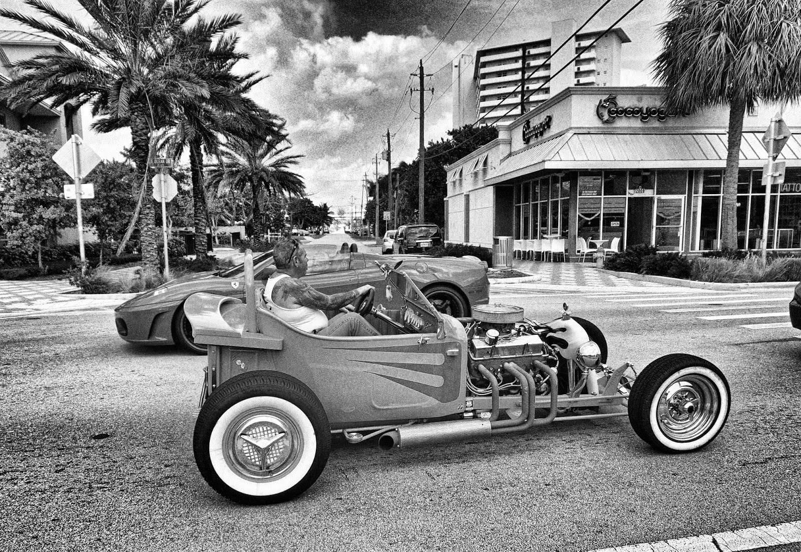
Something I might use! (radius 1500, samples 8, iterations 20).
At this point, the noise is nicely suppressed while the halos have mostly been eliminated. The overall image is still has more contrast than a straight luminosity desaturation, but it’s contrast that has been weighted for the surrounding pixels as well.
Basically, if a luminosity desaturation will choose a pixel value based on a color brightness approximation to your eye, c2g will choose the pixel value based on the value of surrounding pixels.
Perhaps you are familiar with this optical illusion showing the effect on perceived luminosity relative to nearby brightness?
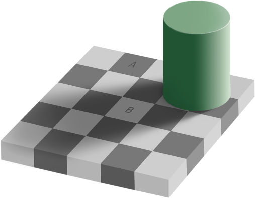
Square A and B are the same shade of grey!
Squares A & B are the same exact shade of grey (open the image in GIMP and check for yourself if you don’t believe me. :) ). The reason we perceive B as lighter than A is due to the way our eyes are perceiving nearby colors (and our expectations that are strengthened by the checkerboard pattern).
Running this image through c2g will align the pixel values closer with what our eye might expect to see:
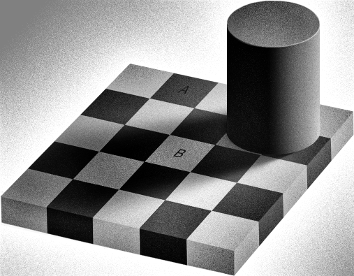
After letting c2g do it’s thing.
After running through c2g, if you check the value average over a few pixels in the squares, you’ll now see that the values have been shifted so that, in fact, square B will be lighter than square A (also the overall contrast has been increased as well).
In short, c2g can be very handy for bringing out micro-contrasts in an image (or increasing global contrast at large radius settings). I rarely use c2g by itself anymore these days, and instead use the results to further refine my images if I feel I want more contrast in some areas (along with a layer mask).
Layer Blending Modes
I’m a little hesitant to cover this particular area of conversion, only because it is not one that I use normally in my workflow. Occasionally I will try this method out, but then usually revert to layering other layers with different results and masking as desired.
The best thing about an approach like this is that you can get instantaneous feedback on the results in your image directly on the canvas.
The basic idea is to use one of GIMPs layer blending modes to convert the image to grayscale, and then to modify an underlying color version of the image to adjust tones.
There’s a few different ways to approach this:
Value

Open your image. Add an all black/white layer underneath it. Set the original (color) image to layer blend mode Value.
This will use the Value of your color layer, but the hue and saturation will be from the layer beneath it (all black/white). Basically, remove Hue/Saturation from your image, and only show its Value.
Now, you can adjust the colors of the original color layer, and effect what the final Value will be. You can adjust any of the color channel contributions like normal, and you’ll be presented with an immediate view on your canvas of what the results will look like. You can use Levels, Curves, or Hue/Saturation/Lightness to make the adjustments. (Really any method that you like that will adjust the colors of the image).
Saturation
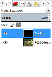
In this method, you’ll add a black (or white) layer above your base color layer, and set the layer mode of the black/white layer to Saturation.
This will use the Saturation of the upper layer, and the Hue/Value from the lower (color) layer.
As before, you can now proceed to adjust the colors of the color layer to taste, and you will see the results of your modifications directly on your canvas.
Color
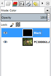
This is similar to the Saturation approach above, but in this case you’ll set the black/white layer to layer mode Color.
This will use the Color from the black/white layer, and the Hue/Saturation from the layer below it (color).
Now adjust colors of the color layer to taste.
- Amelia Bellamy-Royds notes in this Flickr thread that the Color option appears to only operate on the Red channel, but I haven’t fully tested this yet to see what is going on.
Hue/Saturation
You can also achieve similar results directly from a color layer by invoking the Hue/Saturation dialog.
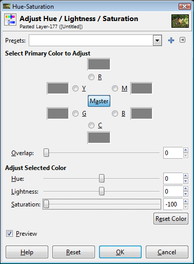
Just set the Master saturation to 0, then you can adjust each of the RGB/CMY channels separately to modify the results (and still get live updates in your canvas on screen).
Play With It
The key to the layer blending modes (and Hue/Sat adjustments) is to experiment a bit to get accustomed to what your changes are affecting. Start with single channel adjustments and a goal in mind. If you want to darken up the blues in the sky, play with that channel a bit in one of these blending modes and see how it affects things.
You’ll have a similar level of control that you would achieve with using Channel Mixer, but with the added benefit of having a full-canvas preview of the effect (as opposed to the small preview window in Channel Mixer).
Nearing the End
I think I’m running out of gas here, but the good news is that the end of the tunnel is in sight (or a train is speeding my way). Either way, the end is near (the next time I attempt tackling a subject like this, please remind me about publishing this series…). If you’ve followed me this far, you deserve a medal, or a certificate or something!
Stay Tuned
In the last installment in this series, I’ll have a look at combining everything we’ve seen so far, and to look at ways to blend them together. This is more often my general workflow these days.