Bouncing Baby Beverly Tutorial (Making Babies Fly)
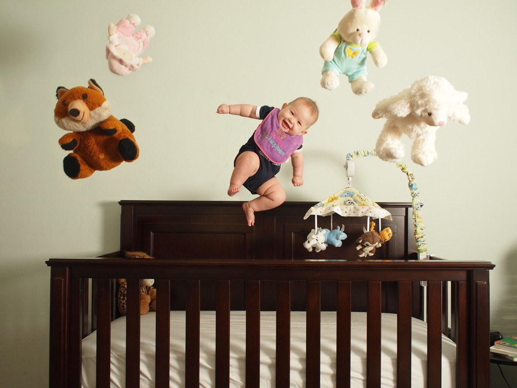
Way back in November, 2011 I had written a tutorial for PetaPixel that walked through how I created the image of my daughter bouncing out of her crib:

I realized that the tutorial only existed over on PetaPixel, and that I should probably just put a copy of it here for anyone interested. So here it is.
My original post of Bev with more examples can be found here.
An earlier post here on PetaPixel showcased the wonderful image created by Indylab of a flock of cell phones and the method used to create it. In a rather snarky comment, I said to get back to me when they started tossing babies, and linked to my daughter merrily jumping in her crib with her toys. Mike was kind enough to approach me about writing up a small walk-through on how I created my image, and who can honestly turn down a chance to show off their baby daughter looking so cute?
Conception
I had this image in my head for quite some time before I actually got a chance to shoot it. It was the result of two things mainly:
- A desire to practice post processing images for compositing.
- A desire to buy a tripod.
My wife let me buy a tripod (for other long-exposure experiments including light painting), but only because I justified it with “a neat idea” for a picture with our daughter (the “I have a great idea for a photo of our daughter, but it will require me to buy more camera gear” defense).
My desire to attempt this shot was born out of how cute I think my daughter is, and her personality is almost always explosively positive and joyful. So in my head I was imagining her just bursting with happiness so much that she literally would be jumping right off her crib. It only logically follows that if she was jumping out of that crib, her stuffed animals would be as well!
Execution
I only had a rudimentary vision of what I wanted the final image to look like, but it was enough to nail down the overall idea. In thinking about framing up the image, I liked the idea of her crib being squared up straight on in the image. I wanted the focus to be on her and her animals, and didn’t want anything else detracting from that.
I set up my tripod and camera (Oly E-P1 w/ 17mm f/2.8) in her room and framed up my shots. I had a DIY softbox for my flash precariously balanced on the bureau off screen to the right (wirelessly triggered), and a large window directly behind the camera lighting the scene.
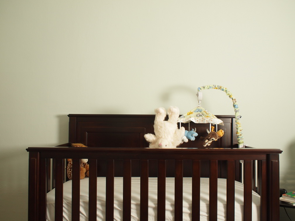
To start things off I needed a single image of the scene without any of the flying objects in it. This image would be the base I would use to later mask out anything I didn’t want (namely, me holding her). I used a spare outtake shot of one of the stuffed animals that was nowhere near my scene as my base.

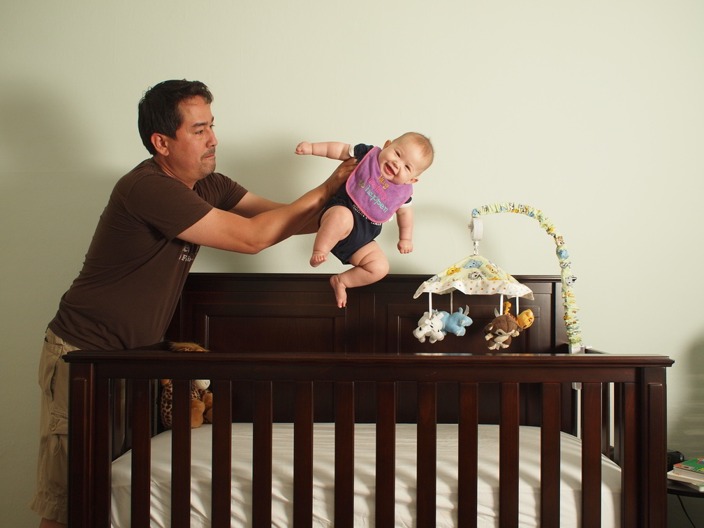
Next set of images were of me holding her over her crib in various positions. Luckily she’s a really good sport about it, and a lot of tickling and kisses between takes didn’t hurt (hint: most models do not take kindly to this, use caution).
Multiple takes were done in order to have the highest chance of a good image of her, and to give me multiple textures to use in post later to assist in masking me out of the image. The trick is to pre-visualize what level of work will be required in post, and to accommodate that when shooting.
For instance, I knew it would be a pain to clean up the edges around her clothing where I was holding her later, so I tried to minimize my hands and arms obscuring her too much.

The rest of the images were quite easy - throw stuffed animal into frame, and fire! Rinse, repeat as necessary (again, multiple shots really pays off here - each animal probably had about 8 or so images made).
The trick to making life easier in post is to make sure that the lighting and exposure is controlled to be as consistent as possible between shots - you really want everything lit with a consistent power and direction.


Post Processing
This is really where the vision begins to come together for me. I’ll usually fire up my image editor (GIMP in my case, PS for those of you with a little extra cash), and set my first image of just the background environment as my base layer.
This first image with nothing on it becomes the background against which I will begin masking out objects I do not want from subsequent layers. I loaded up each of my other shots as layers in the image to get a rough idea of placement within the scene (some stuffed animals would overlap each other in some shots - I picked through all the images until I found ones that I liked).
Then I start working on removing myself from the image. With an environment background this is relatively quick to add a layer mask in GIMP and paint over myself on the image to show the base image through in a big, rough way (the only place I slowed down was nearing the edges).


The devil is in the details, they say, and nowhere is this more apparent than when trying to make a clean edge mask from a background.
There really is no quick and easy shortcut to getting good results here - a small radius brush and patience is your friend. Too hard a brush and the edge looks fake immediately, too soft a touch and the edge looks fuzzy and fake immediately. Somewhere in between is a happy medium, and that’s what I was aiming for.


Luckily, I remembered to take multiple shots, so in places where the edges were not cleaning up as well as I would have liked I “borrowed” portions of the other shots to make the edge cleaner (the side of her body by the bib is from another shot, as is her sleeve). When working on edges like this it really does pay off to have multiple takes to draw from!

Once I had blocked myself out of the image, I continued the process by adding layer masks to each of the stuffed animals, and painting them back into the visible image (by modifying the layer masks). No overlapping animals made this a bit easier, but you’ll notice that something key is missing from this version of the image.
Shadows!
That whole devil and details thing again. The trick now was only to create some fake shadows for Beverly and her animals that didn’t have shadows (the doll at top left already had one).

The shadows are key in lending a sense of realism to the final product. They were made by simply approximating the shape of the shadow, filling with an appropriate shadow color (sampled from other shadows on the back wall), and blurring to taste. After that I just adjusted opacity by eye until it all seemed reasonably well blended.
Overall I was happy with how this image turned out, and it really was fun creating it (despite what looks like a lot of tedious work). I’ve since done others along a similar vein, but this first one still makes me smile when I look at it…
