New RawTherapee Website
Just over a year ago I started a redesign and rebuild effort for my friends over at https://www.rawtherapee.com. Then life happened.
After a long hiatus I was finally able to spend some time working on it and we finally launched it just a few days ago!
For those not familiar with the project, RawTherapee is a wonderful tool for developing raw photographs. It’s one of the first Free Software raw processing tools I used (prior to that it was the classic UFRaw project as a pre-cursor to bringing the image into GIMP).
I’ve been lucky enough to be friends with the project for years now. We migrated their old forums to discuss.pixls.us way back in October 2015 and I get to chat with them almost daily. They are an incredibly awesome group of people!
Like the work I did for my other favorite raw processing project, darktable, I really wanted to build them a new site to update their old one and make managing it easier. The old site was not responsive either, so it rendered horribly on tablet or phone screens.


Bottom: The last version before the new design. (via the Wayback Machine)
Providing these types of services is one of the primary reasons for starting the pixls.us community in the first place. We provide infrastructure and management for these projects so the developers don’t need to worry about it and can focus their efforts on improving their projects.
I just hate that it took so long to build them something!
New Design
Originally we were looking at some static left-column navigation layouts and had actually made a little headway before I got sidetracked (it was only a year!).
Then in June 2019 community member mariuszdaniel posted about a redesign he had mocked up. The team liked it and with a good reference design to start from Mica and I were able to start working on it again in earnest.

This time we were asked to use a library of some sort and Mica leaned towards using Bootstrap 4. This was a bit of a departure for me as I don’t normally tend to use libraries but I have to say it wasn’t so bad at all.
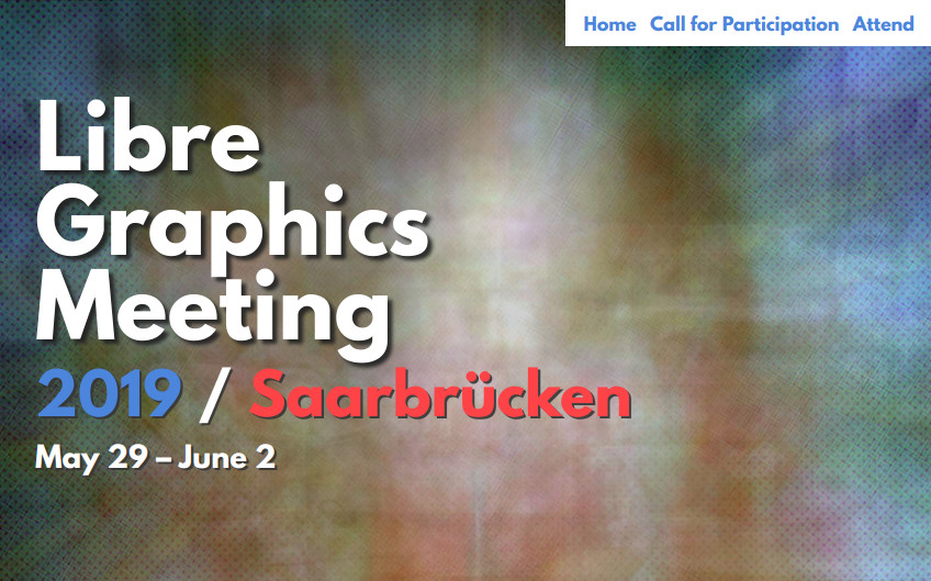
Ever since I worked on a mock-up for the 2019 Libre Graphics Meeting I’ve had an affinity for bolder headings with fonts like League Spartan. And I felt like it was a good fit for this use case. The team didn’t want to clutter up the site with too much stuff so the sparseness lends itself well to bolder heading/nav elements.

Hugo
Anyone that’s been hanging around me knows I’m a big proponent of Static Site Generators (SSG). Blame darix. These are systems that will take a directory of content and compile the whole thing into a website for you. The advantage is the minimal requirements to actually serve the website - just a webserver. No need for any scripting or programming languages on the server (or a database). This reduces the attack surface on the server and speeds up browsing (it also scales much better than a database-backed scripted website).

We had previously used Hugo for compiling the digiKam website so we had a familiarity with it. Honestly, the experience was so nice site that it was a natural decision to use it again here. (Hugo is also insanely fast.)
One of my personal favorite things about Hugo is the design decision to mimic the hierarchy of the source content for creating the website.
Directories under content/ in Hugo become major sections, and content lives underneath them.
They talk about this in their docs under Content Organization and I dig it. :)
I dig it so much that it should be trivially easy to port this website away from Node.js and metalsmith into Hugo, which is probably going to be a quick weekend project for me to play with soon! Well, I’ve actually got a couple of other projects to keep me busy for a bit first (stay tuned!) but it’s definitely on my radar.
